Siena’s Bronze Treasures Land in New York for a First-of-Its-Kind Exhibition
The show brings together about 40 Renaissance masterworks, many of which have never been presented outside of Tuscany.

This article is featured in our Fall 2026 print issue, available now.
Designers are always preoccupied with a looming debate: how much any space should adhere to tradition, and when to toss it all aside for something new and truly different. When Ludovica Serafini and Roberto Palomba—a lauded Milanese studio known for their residences, exhibition designs, and furniture for the likes of Poltrona Frau, Kartell, and others—were asked to redesign a nearly forgotten jewel box of a penthouse in the heart of Rome, the 3,000-square-foot project brought with it numerous challenges both aesthetic and personal. The pair originally worked in Rome before moving to Milan, shifting from a city known for its eternal soul to one that is synonymous with staying perfectly on trend. Luckily, Serafini, who took the lead on the apartment, was able to use sultry green walls, repurposed tiles, and a subtle balance of materials to draw in needed light, blend modernity with antiquity, and turn a formerly disused space into one that’s arguably the envy of any Roman citizen. Oh, and about that view…
Rome is filled with history, but this particular address is quite remarkable.
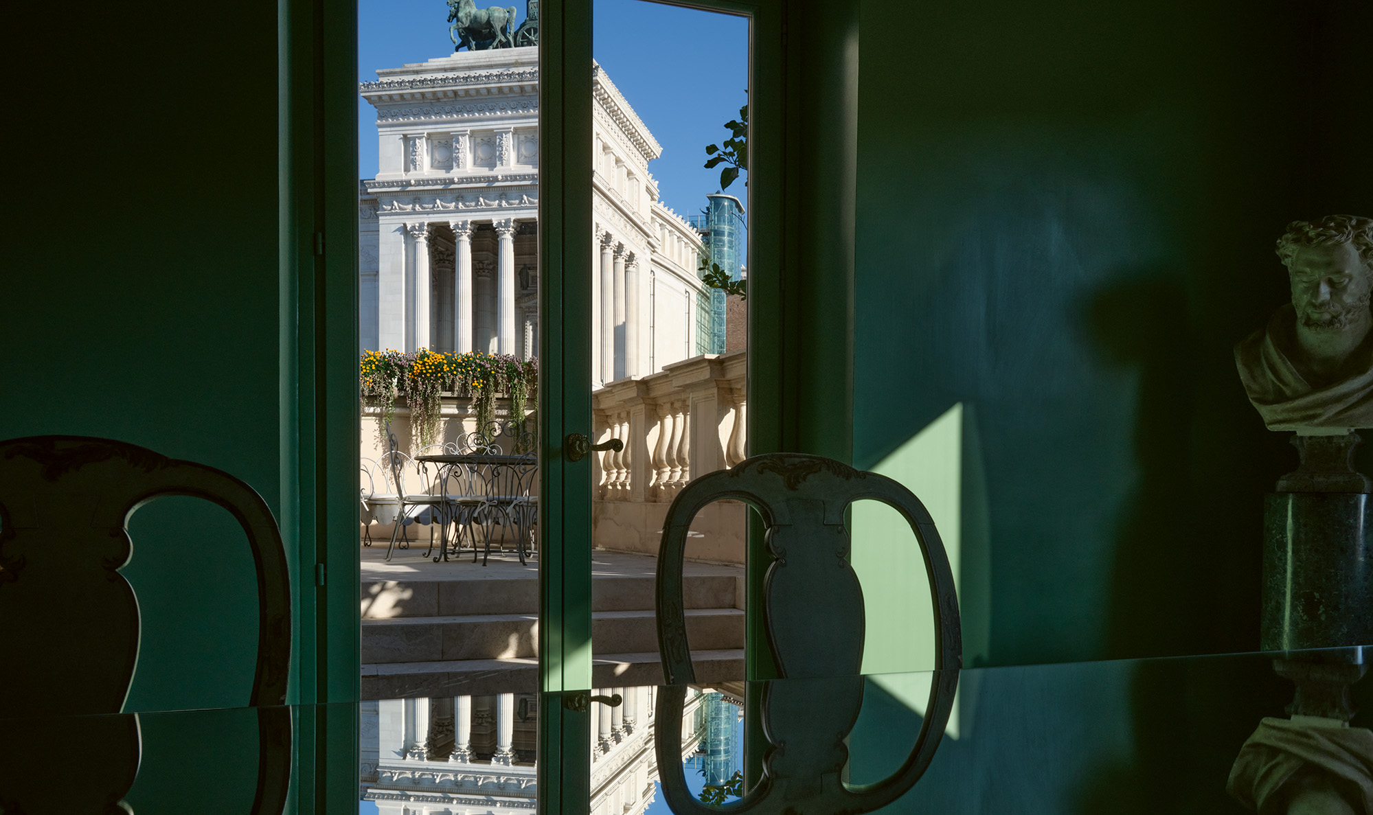
Ludovica Serafini: This was the palace of an aristocratic family and one of their most prestigious residences. The initial tower was built in the 1300s—Rome had many towers at a certain point—and then the rest of the building was renovated and enlarged in the 1700s by the same family. It’s part of the Italian landscape, you could say. It’s located in the heart of Rome; on one side is the Piazza del Campidoglio and on the other side is the Victor Emmanuel II National Monument, also known as the Altare della Patria, a monument of the Italian state built in the late 19th century after unification. The monument is part of the Capitoline Hill, and its surrounding structures were designed by Michelangelo in the 16th century—the piazza’s oval design is especially famous—and in the middle stands the statue of Marco Aurelio.
And this apartment is on the top floor of the palazzo?
Roberto Palomba: Yes, but it wasn’t always like this. The first floor of aristocratic palaces was called the piano nobile, the noble floor, because that was where the family lived. It was the opposite of what you would expect today; the higher the floor, the less desirable it was, because you’d have to walk up flights of stairs. The rooftop, at the time, was not considered important or desirable at all. So when the family lived in the palace, they occupied the first floor. Then, closer to the 1900s, elevators were installed and everything changed. The top floor became a luxury and this terraced penthouse apartment became something unique.
You started from something of a blank slate—nobody had lived here for almost 20 years. How did you approach this renovation?
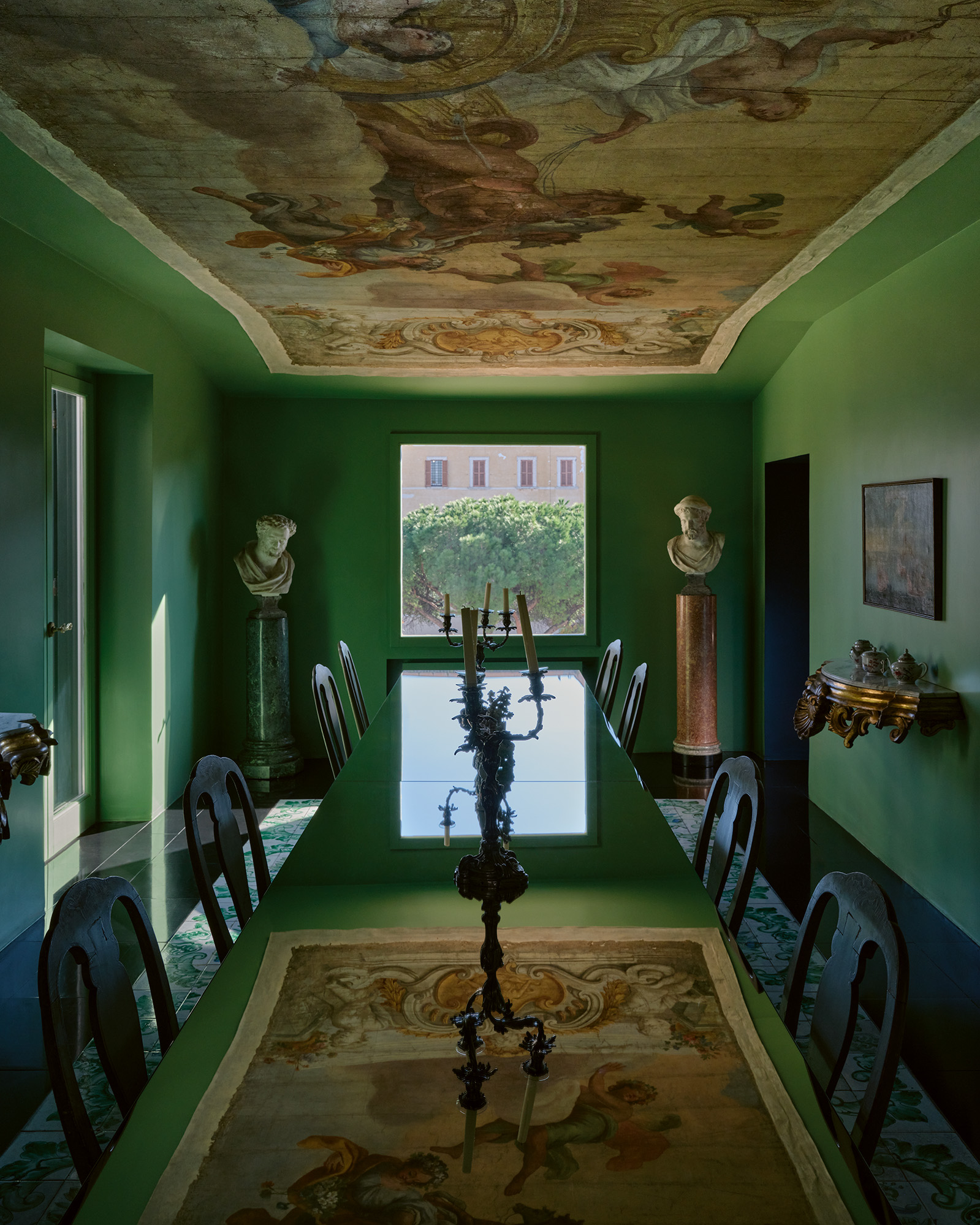
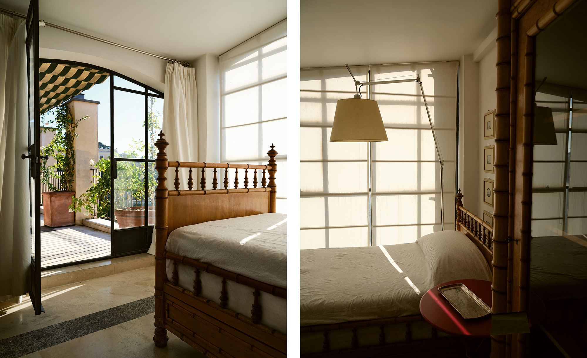
LS: To describe the layout, it was a white space with a large terrace and a second terrace at the very top, with a small room off of it. The wonderful thing about this house was that the different rooms seemed to have a certain character of what they could become—the size and proportion were quite perfect already without having to move any walls. For example, the dining room was ideally suited for a long table because it was rectangular with a window that looked out to the Campidoglio. From a design standpoint, the apartment had an important relationship with the outdoors because of the terrace. The mood had to reflect the joy of the outdoors, even inside.
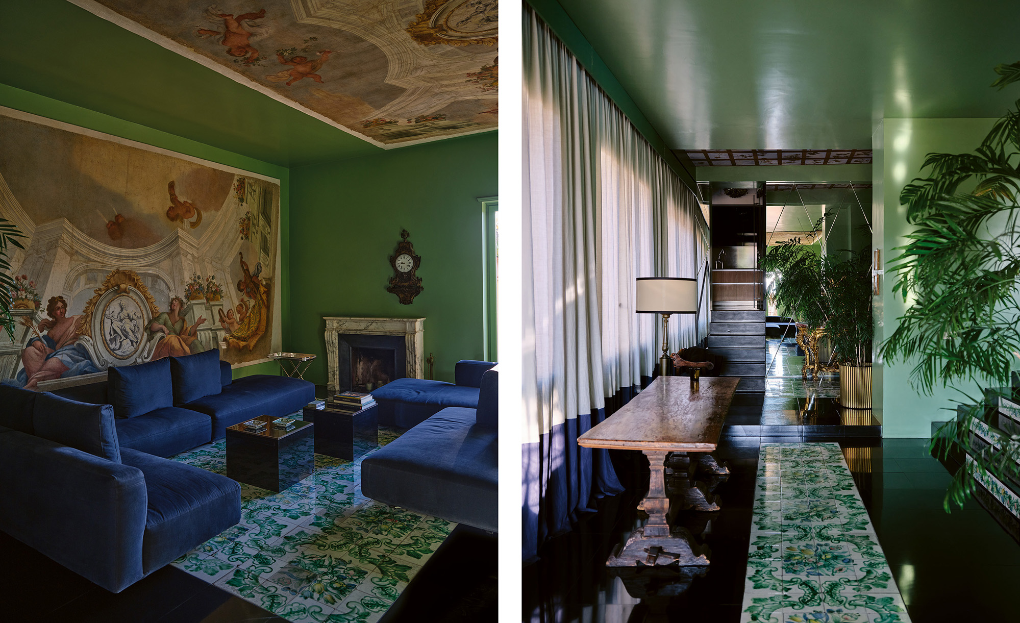
One of the things that strikes you right away is the use of the color green. It really envelops the apartment.
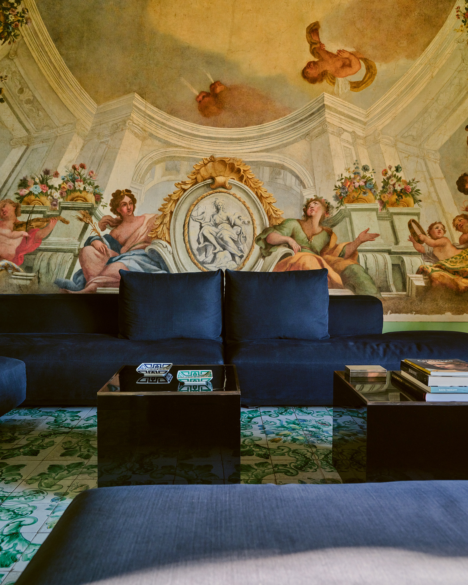
LS: The color began with the tiles, actually. One of the owners comes from the south, from Naples, and salvaged these tiles from their childhood home. These tiles were almost completely destroyed, so we only had a portion of them. The ones we were able to preserve were installed with a black border, creating the effect of a rug. After we had decided on the floor, it seemed that the only thing left to do was to paint the walls green, all in one color. We chose this predominant green, together with blue, as the project’s signature colors, forming the common thread that runs throughout.
All that green makes the art in the apartment truly stand out, too.
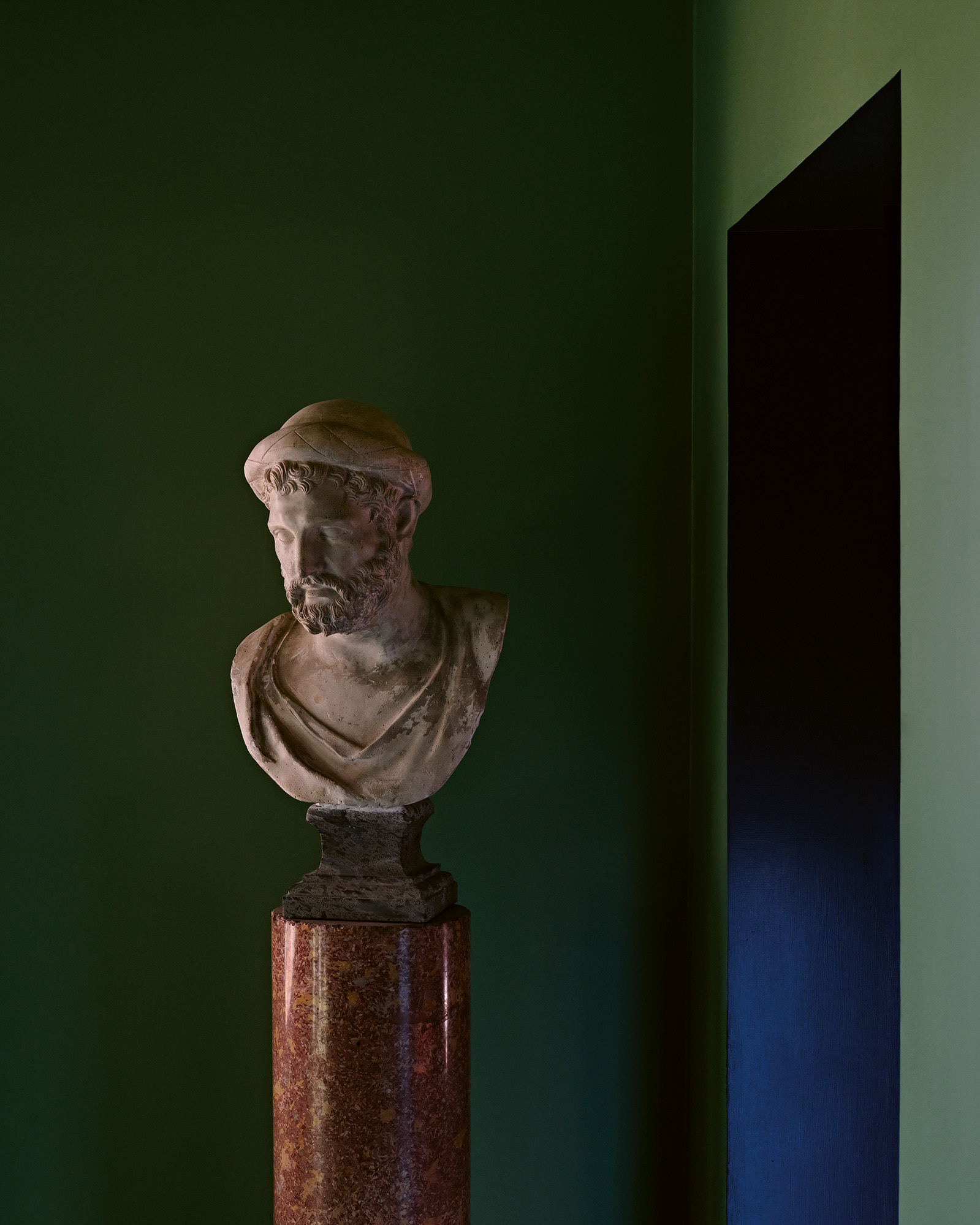
LS: On the walls are remarkable 17th-century paintings from the owners’ private collection. The busts were also selected from their collection of plaster casts. These 19th-century replicas reflect a widespread practice of the time: before the development of modern reproduction techniques, plaster casts of classical masterpieces were created to bring the beauty of antiquity into people’s homes.
What was the biggest challenge you encountered?
LS: For me, the biggest challenge was returning to Rome; to find a way to work here and to design in these very classical homes without creating something that felt artificial. I am from Rome originally, and Roberto is from Sardinia, but we left the city when we were 30. Rome was very Baroque at the time, and people were trying to reproduce, in buildings like this one, a time that had already passed. We were looking for something different.
RP: But we didn’t want to bring Milan back with us to Rome, either. This is definitely a Roman project. The challenge was to find a balance between a contemporary vision and respect for the architectural heritage of the building and the cultural heritage of its owners. We didn’t want to include fake marble columns and frescoes, things like that. Every element that we preserved is original, and what we couldn’t save is contemporary and clearly so. Normally, these aristocratic buildings are filled with colored walls, silks, and Baroque gold. What’s unique here is that it’s still rich, because of course it’s not minimal, but at the same time it has joy and lightness. We rescued a little bit of life from the heavy Roman style.
After being based in Milan since the 90s, what struck you about returning here, from a design point of view?
LS: One of our largest considerations was the light in the house, both natural and artificial. Designing a house in the south is different from the north, because the daylight is completely different, so your use of colors, materials, or even the width of the windows, changes.
RP: What’s really striking in Rome is the color of the sky—there’s no other place in the world with this shade of blue. It’s in the middle of the country, so the southern light begins in Rome, but you still have the intensity of the north. The light is so clear and it’s quite windy, so the sky appears blue. When you walk in the street, the buildings cast very dark, black shadows. And then you have all the use of white travertine around you, the stone of Rome. And above your head run these rivers of blue sky. To me, that’s Rome.
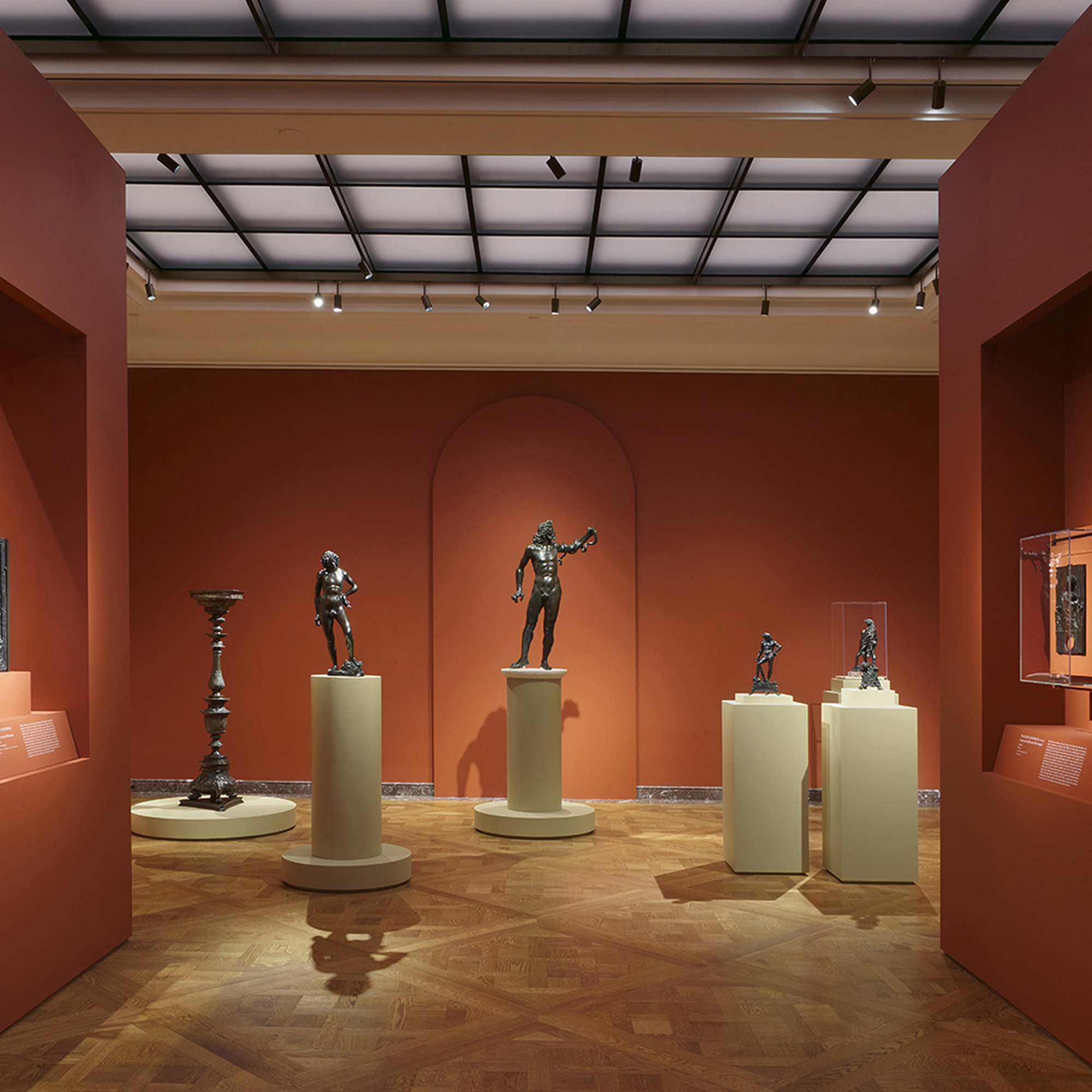
The show brings together about 40 Renaissance masterworks, many of which have never been presented outside of Tuscany.
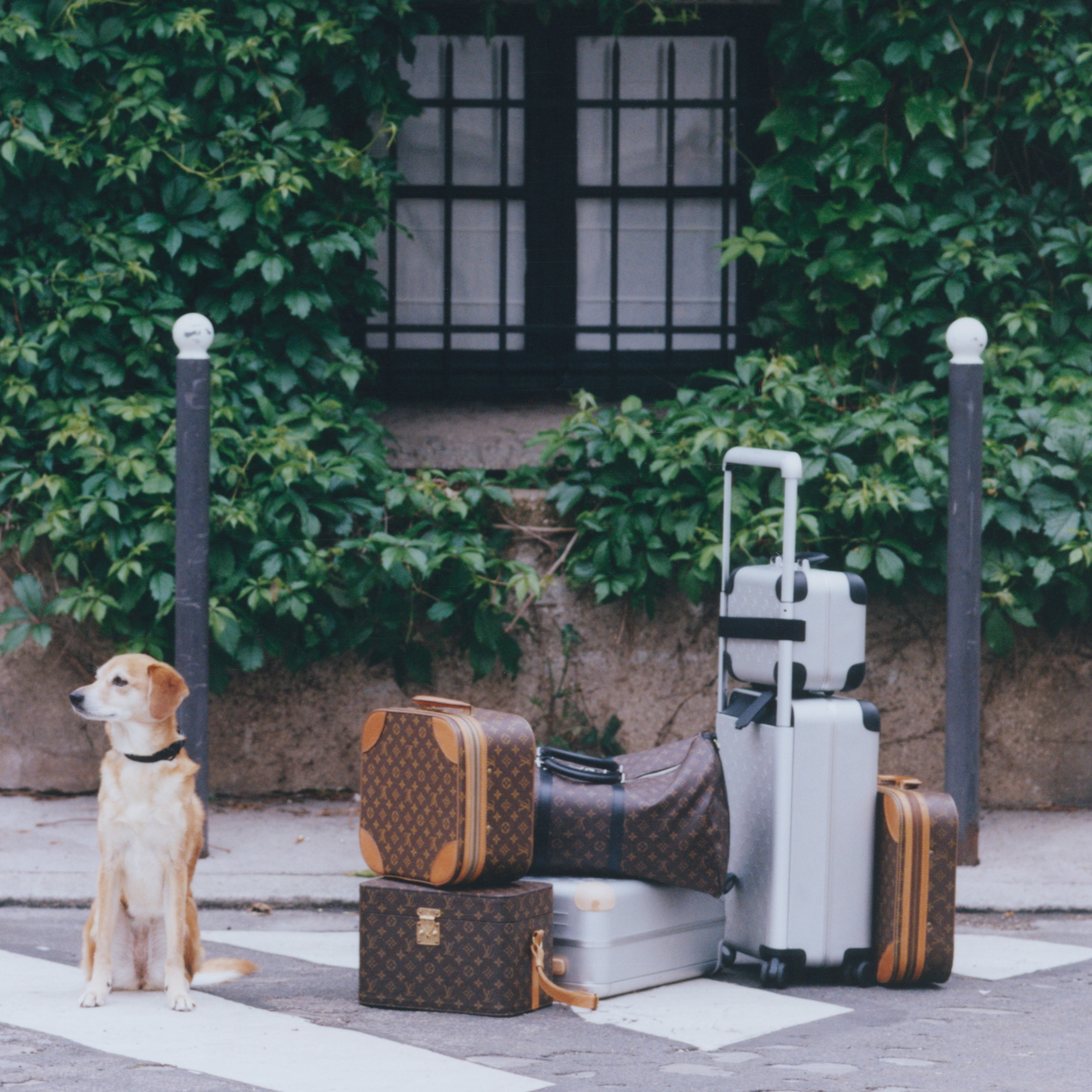
As the Horizon suitcase returns in aluminum, the Louis Vuitton founder’s descendant reflects on its legacy, the mystery of the Monogram, and how he packs for a trip.
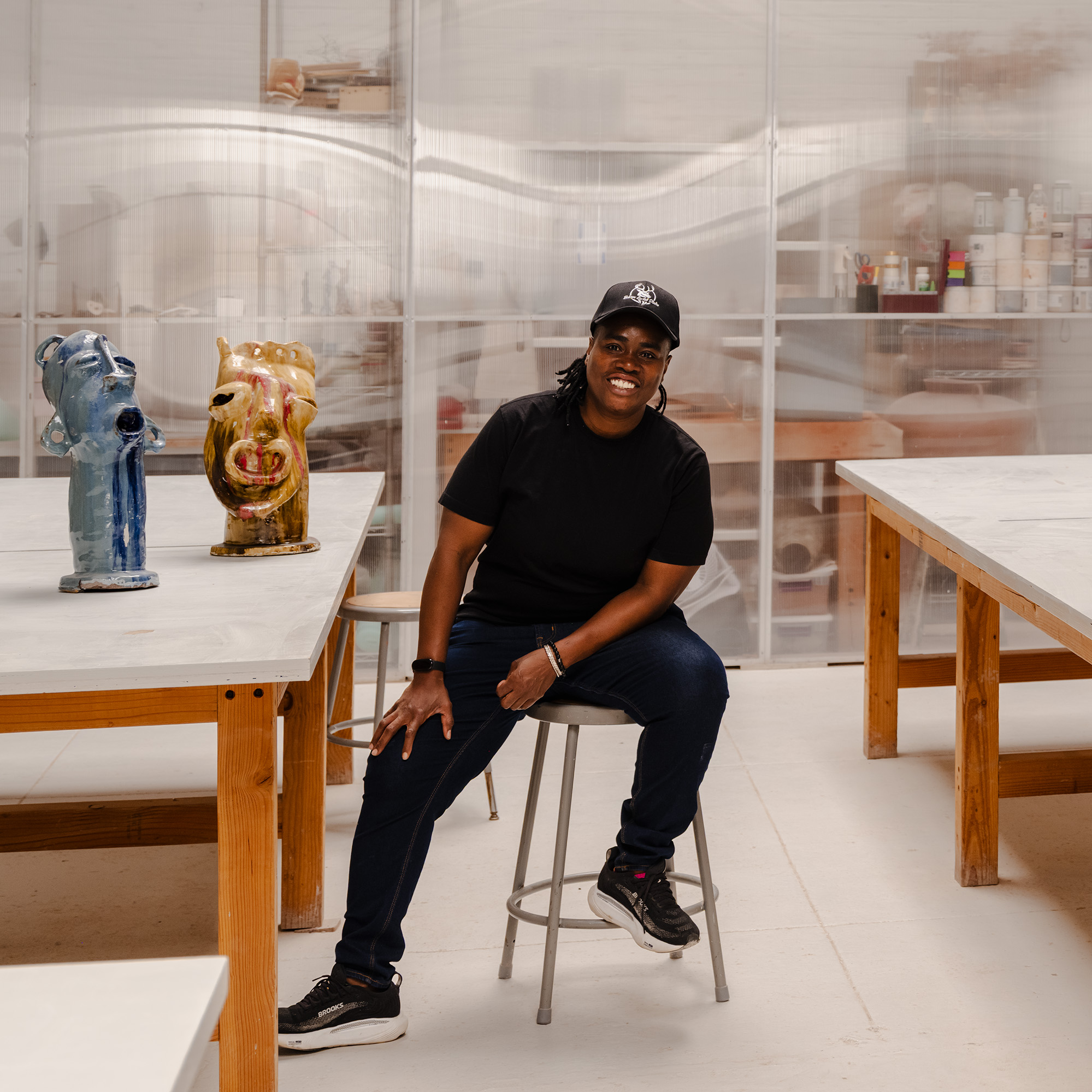
The Ugandan artist fled her homeland following the draconian Anti-Homosexuality Act of 2014. Her work tells the story of its queer community, with a breakthrough solo show now on view.