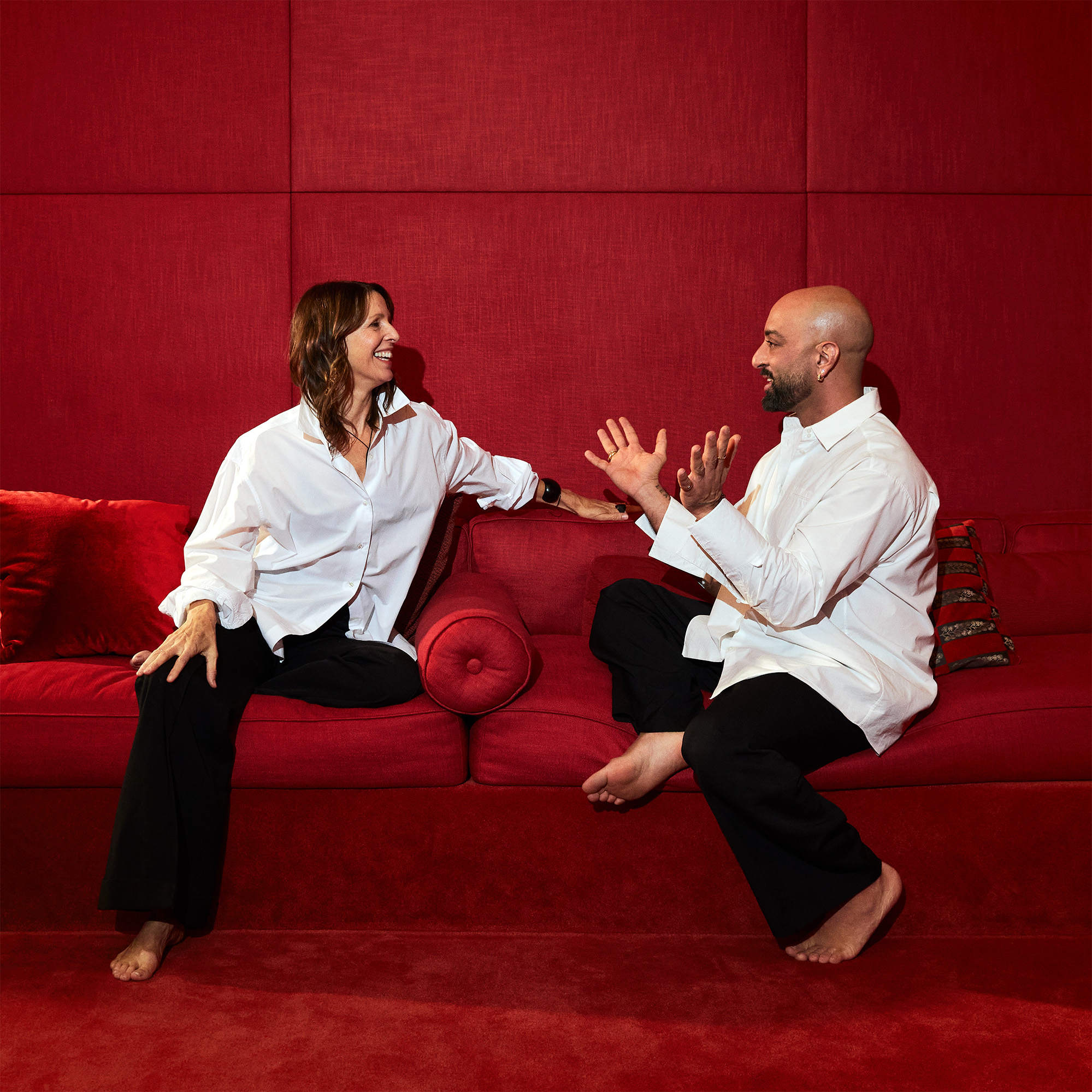
What the Director of Costumes for the New York City Ballet Learned From His Storied Collaborations
The man behind the pleats and frills of the beloved New York City Ballet; Our favorite art and design openings from MoMA to The Jewish Museum.
September 25, 2024By
THE GRAND TOURIST
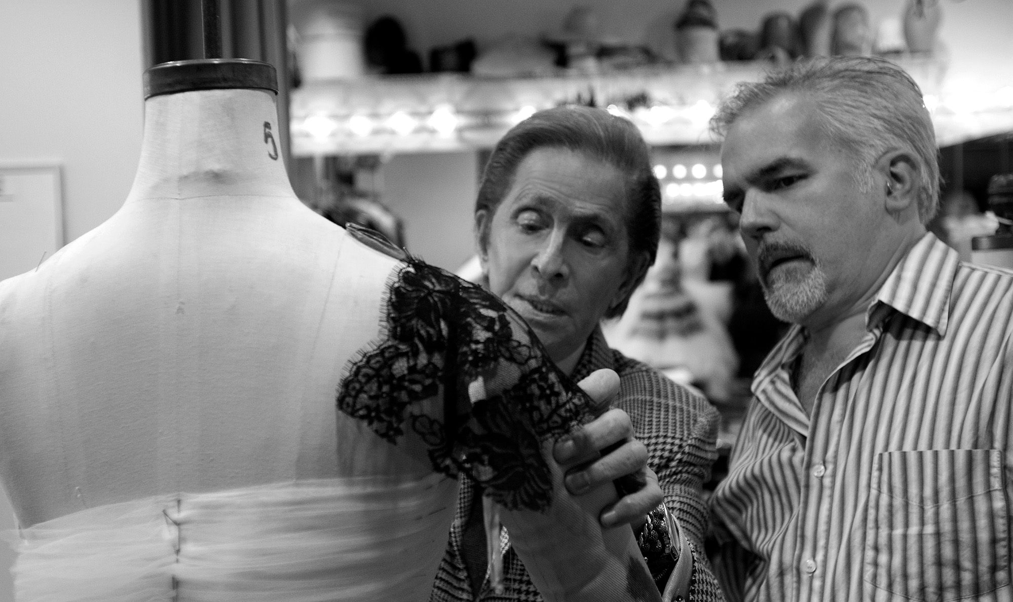
Valentino and NYCB Costume Director Marc Happel in the NYCB Costume Shop. Photo: Paul Kolnik
Welcome to The Curator, a newsletter companion to The Grand Tourist with Dan Rubinstein podcast. Sign up to get added to the list. Have news to share? Reach us at hello@thegrandtourist.net.
This year marks Marc Happel’s 18th as director of costumes for the New York City Ballet and his 12th year working on the company’s Fall Fashion Gala since its inception in 2012. This October, the NYCB will stage a world premiere ballet by Caili Quan with costumes by Gilles Mendel of the House of Gilles, the return of Tiler Peck’s Concerto for Two Pianos with costumes by Zac Posen, and the NYCB premiere of Gianna Reisen’s Signs with costumes by Happel himself.
Happel has seen the event through its many iterations throughout the years, partnering with designers from Valentino to Iris van Herpen and Dries Van Noten to create costumes for the company. The goal of the gala is to celebrate the most exciting artists from the synergistic worlds of fashion and ballet and to raise money for the following year. (Since its inception in 2012, this annual celebration of ballet and fashion has raised more than $30 million for the New York City Ballet.)
“There’s a real challenge to making things that look delicate that are very strong and durable,” Happel says of the precarious tightrope they walk. For 2024, he is working with two NYCB design veterans—he knows they understand the difficult task to mold their runway-ready designs to an NYCB principal dancer. In doing so, Happel has identified designers’ strong suits, like Mendel’s love of embroidery and Posen’s strength in pleating, and helped them to blossom into a mini “collection” of costumes for the corps de ballet. “It always has been, for the most part, a joy,” he says. “A challenge…and a joy.”
Ahead, the costumer takes us through the process of working with such legends, what he’s learned from them, and how fashion and ballet overlap, more and more every year. —Camille Freestone
What was the process like this year working with Giles Mendel and Zac Posen? We’ve already done two ballets with Gilles, spread out over the years. It’s always an easier fit when you know someone and you know how they work. You can predict the direction they’re going to go. Gilles has become very well known for his pleating, so this ballet has quite a bit of that, as well as a good deal of embroidery, which he’s using a lot of these days. He’s combining all of that with corsets he’s designed for both the women and the men. The corsets are then covered with this embroidery based on iron gates. All of that is being done in Mumbai. It’s so beautifully done. And then another element of his ballet is ombré. All the corsets are ombré in some way, as is the pleating that is part of the bodice.
With Zac, again, it was another situation where we had worked with him before, so it was familiar territory. Coincidentally, Zac was very much about pleating as well, through the bodice and torso, which then releases into a full skirt. Rather than doing sketches, he likes to drape things himself on a form. He has them all brought in on dress forms for us to interpret. It’s a different kind of procedure than we are used to. Usually, you get sketches from a designer.
How do you condition a fashion designer who’s used to designing for the runway to design a collection for dancers? Many times, we send them videos of rehearsals, so they see what these dancers are doing. I will talk them through it, looking at sketches and then perhaps making suggestions for changes that could make them more danceable. More often than not, they understand immediately. There are so many great stretch fabrics out there, versions that I can talk them into. Instead of using a regular chiffon, use a stretch chiffon, or use a stretch charmeuse.
How do you balance a designer’s desire to make something opulent with the need for something the dancers can move in? Is it an issue? It is, sometimes. Often, that’s a conversation that the choreographer has with the designer. For choreographers, it’s important that the body is not so layered with ornamentation and fabric that you can’t see the movement clearly. Many times, it comes down to skirt lengths to keep the leg visible. There have been times when a choreographer has worked with a designer, and they’ve specifically wanted to obscure the body. One that comes to mind is Sidra Bell working with Christopher John Rogers. The dancers started out in these very large, body-transforming garments, but then they slowly stripped them away to a leotard and tights. But most are very aware of the fact that they’re coming into a situation where it is all about body and movement.
To help designers realize the world they’re coming into, I will put a dress form with an old costume at the end of a very long hallway and say, ‘What you’re looking at is row A. Everybody else is farther away than that.’ I see the light turn on. They realize they have to go much more graphic, and that the tiny little details are basically going to disappear with the distance from the stage of the audiences. And there’s the lighting, which changes color so radically. We have to make costumes that can last through a season of sometimes five, six, seven performances, heavy sweating, a lot of dry cleaning, then can come back again the next season and be worn all over again, sometimes by different dancers.
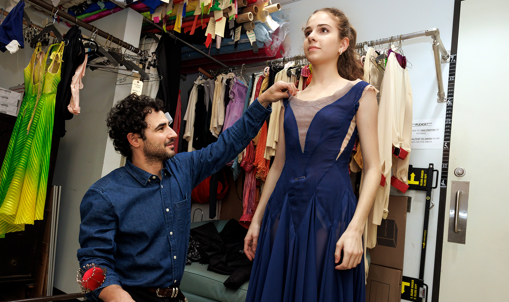
A costume fitting with designer Zac Posen for Tiler Peck’s Concerto for Two Pianos. Photo: Erin Baiano
Do you ever think about the timelessness of design for these costumes? Or are you okay with nostalgia? Oh, I’m totally okay if it looks reminiscent of a certain era. I don’t think you can really limit yourself in that way. I think that all design in some way is based on the past. We’re always looking at things to inspire us that have worked, or have been aesthetically pleasing or design-wise have been very successful. I think that that can also be said for looking at other decades or periods of design. In a lot of ways, what we’re doing right now with Gilles Mendel—these corsets—are based on another time period when corsets were worn.
Do you ever look at contemporary runway collections when you’re designing new costumes for ballets? Oh, sure. All the time. I hate to say it because it just becomes such a cliché, but I always look at Alexander McQueen. He was a genius. And Sarah Burton carried on the torch in a lot of ways. But more often than not, I look at the periods when he was alive and designing for the line. I look at older Christian Dior when he was designing for the line. A lot of times it’s those older collections for me—Christian Dior, Balenciaga, Yves Saint Laurent. They had such incredible clear lines and such an amazingly clean aesthetic that works so well for ballet. You can take a lot of what they did and interpret it into dance costumes. Maybe because the choreographers are looking for danceable design in their approach to fashion, but many designers are coincidentally looking at fashion in an almost athletic way. I think fashion has gotten very athletic in some ways, and that works in our favor.
Who have been some of your favorite designers to work with throughout the history of the fashion gala? It’s hard to single out any of them. Have there been favorites? Of course. We started with Valentino, and he became a favorite because he surprised me in that he was so hands-on. He was very excited about it. I loved seeing that excitement from this legend. He was here in the fitting room all the time and would sit and talk to me about the most minute details that he wanted to see happen on the clothes or call me from his yacht in the Mediterranean to talk about an aspect of a costume.
Also, Dries Van Noten. That was a small ballet, but such a highlight for me because the man is a genius. It afforded me going to Antwerp to meet him and talk to him in his office about the clothes—a personal highlight. Iris van Herpen was another, because working with plastic was a challenge for the shop—everything was covered with these plastic shards. We actually found a way to work with computers, which is very hard in the costume industry but saved us enormous amounts of time. I always talk about Thom Browne, but he was a favorite. He was another one that was incredibly hands-on. Anna Sui. It was great to work with a New York designer. She tells a very funny story about getting on the elevator with her assistant Thomas. Some of the principal dancers from the ballet got in the elevator, and Thomas’ face lit up. He was so enamored of these dancers. In some way or another, there’s always been great joy in working with them.
This interview has been edited and condensed.
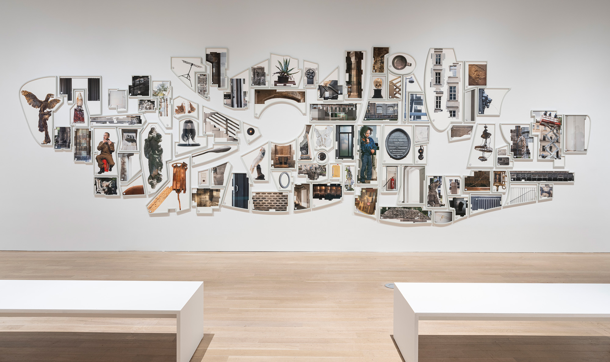
“Shifting Degrees of Certainty” by Ilit Azoulay. Photo: Courtesy The Jewish Museum
Clowns, Collages, and Shadows; These Are All of Our Favorite New York Openings
“Ilit Azoulay: Mere Things” (Until Jan. 5) On graduating art school, Israeli-born, Berlin-based photographer Ilit Azoulay found herself constrained by the conventions of photography—one shot and one lens was too confining. To counter this, and with a keen interest in historiography, she digitally composes large-scale montages out of archival imagery. Her U.S. debut show features her compositions from the past 15 years, which examine how institutions preserve history. One depicts historical objects in an arrangement that might vex some curators, but that highlights unconventional details of history. thejewishmuseum.org
“Jon Serl: No Straight Lines” (Until Oct. 26) Jon Serl was a traveling theater performer, a voice-over performer for the new Hollywood talkies, and a migrant fruit collector during the Great Depression, all before he settled in Southern California in the 1940s and started painting. His upbringing in theater and nonconformist bent lent itself well to clownish characters, theatrical scenes, and brash landscapes. Nevertheless, Serl died in 1993 in relative obscurity. His folkish paintings are poised for a proper revival in this show. davidzwirner.com
“Jiro Takamatsu: The World Expands” (Until Nov. 2) In 1964, postwar Japanese artist Jiro Takamatsu began painting the soft, blue-hued shadows of people on white backgrounds. The series, titled “Shadow Paintings,” which he continued until his death in 1998, are his most famous works. The simplicity of these pieces are pregnant with associations: silhouettes seen through paper shoji sliding doors, chilling imprints left by the atomic bombing of Hiroshima, the shadowy illusions in Plato’s allegory of the cave. Over four decades, Takamatsu used the mediums of sculpture, photography, drawing, and performance to examine perception and absence. This show presents his conceptual ruminations, featuring his shadow paintings, drawings, and lesser-known geometric perspective paintings. pacegallery.com
“Life Dances On: Robert Frank in Dialogue” (Until Jan. 11) Swiss photographer Robert Frank’s magnum opus photobook The Americans caused a cultural reckoning on its publication in 1959. But by then, a disillusioned Frank had rebuffed street photography and was onto other things. This exhibition showcases his later work, including short films and landscape photography, from the next 60 years—not to be overshadowed by his most famous accomplishment. moma.org
“Mexican Prints at the Vanguard” (Until Jan. 5) In the years following the Mexican Revolution in 1920, printmaking was a politically potent medium for addressing social concerns and resisting fascism. Printmakers were drafting the iconography of the modern nation. The image of a skeleton woman wearing a big ostrich-plumed hat, created by Mexican printmaker José Guadalupe Posada and reappropriated by Diego Rivera in a mural, remains close to Mexican identity today. With 130 woodcuts, lithographs, posters, and screen prints from the 18th to mid-20th centuries, this survey highlights the profound history of printmaking in the country. metmuseum.org —Vasilisa Ioukhnovets