What Happens When a Fashion Designer Turns to Textiles?
With an outsider’s eye, fashion designer Sander Lak is the perfect talent to bring a dynamic range of colors to a new collection of Maharam fabrics.
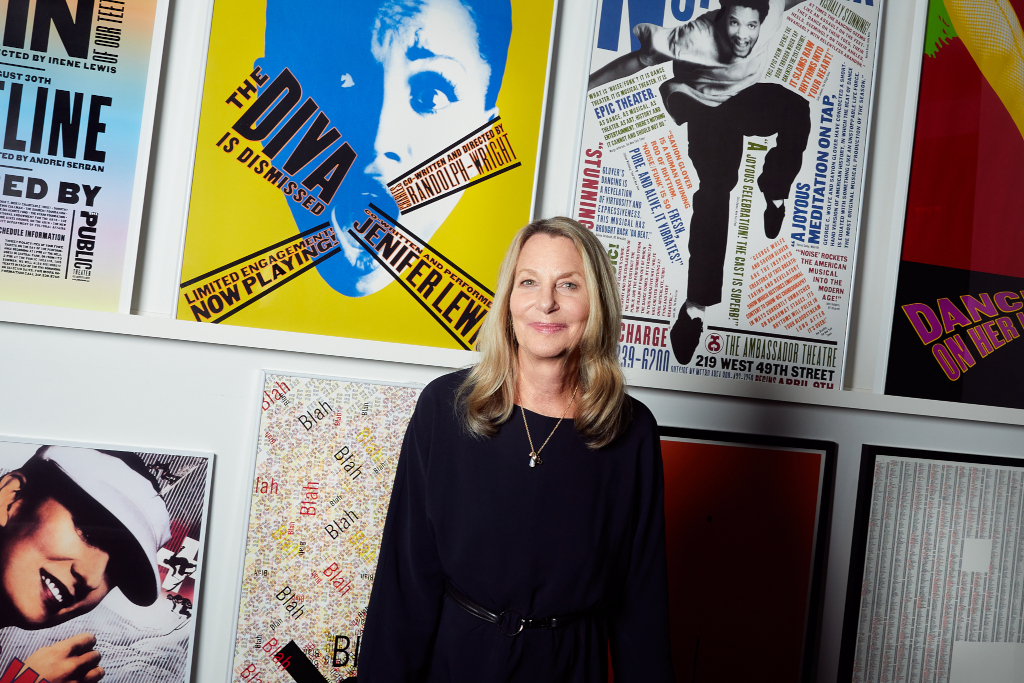
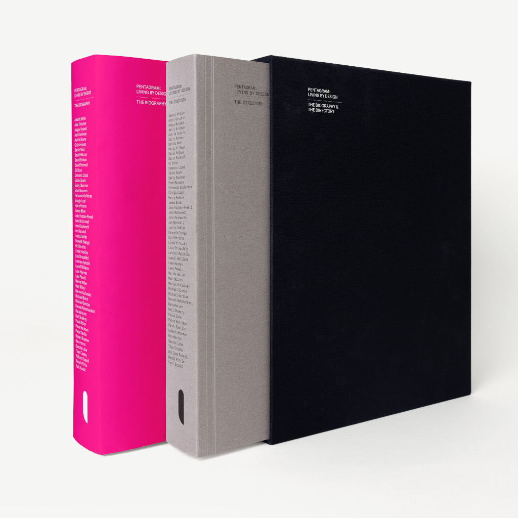
As a trailblazer in art direction and graphic design for decades, Paula Scher is one of the most respected names in her field. Recently celebrating the 50th anniversary of Pentagram, the international design firm she joined as a partner in the 1990s, Dan and Paula explore the ins and outs of her incredibly impactful and creative career, her early days as an album cover designer, and just what good graphic design even is.
Paula Scher: Design is collaborative and very often I’ll start with a thumbnail that’s an idea. They might begin to work up the way they see it is better than what I drew. So, then I’ll change course and say, “Hey, then it could be this.” That’s what the process is. I think that’s a good energy and it’s also wonderful to learn from your partners, to compete with them, and to try to stay young. I think I benefited from that for years.
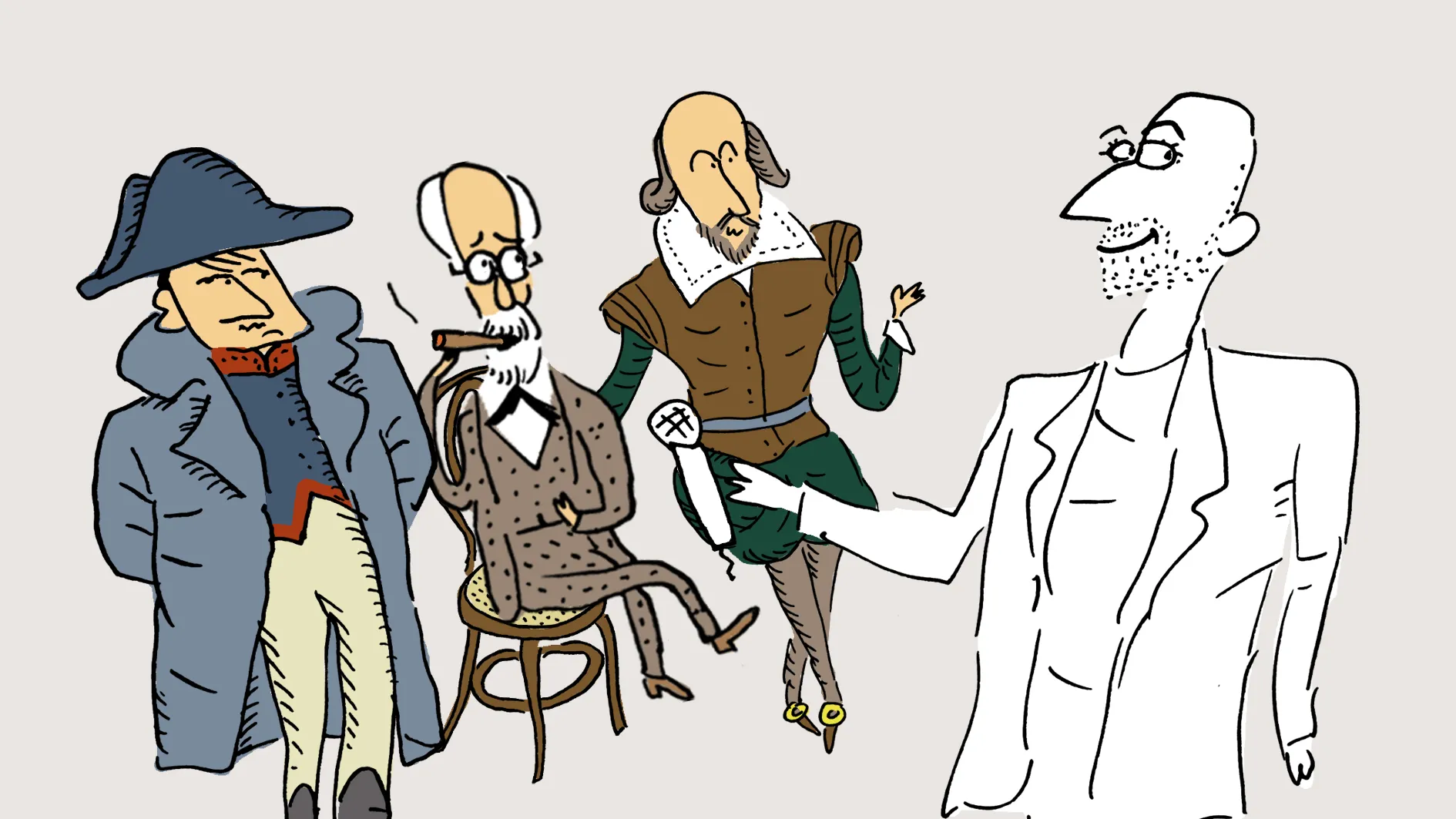
Dan Rubinstein: Hi, I’m Dan Rubinstein and this is The Grand Tourist. I’ve been a design journalist for nearly 20 years and this is my personalized guided tour through the worlds of fashion, art, architecture, food, and travel, all the elements of a well-lived life. My guest today is a true American original, a trailblazer, glass ceiling shatterer, artist, educator, consummate New Yorker, and above all, a graphic design powerhouse, Paula Scher. Her work has advanced the discipline to new heights and in unexpected ways. Throughout her 50-year career, not only has she created some of the most memorable and groundbreaking designs and identities, but she’s enhanced the professional lives of her compatriots at the fame design studio Pentagram as a partner.
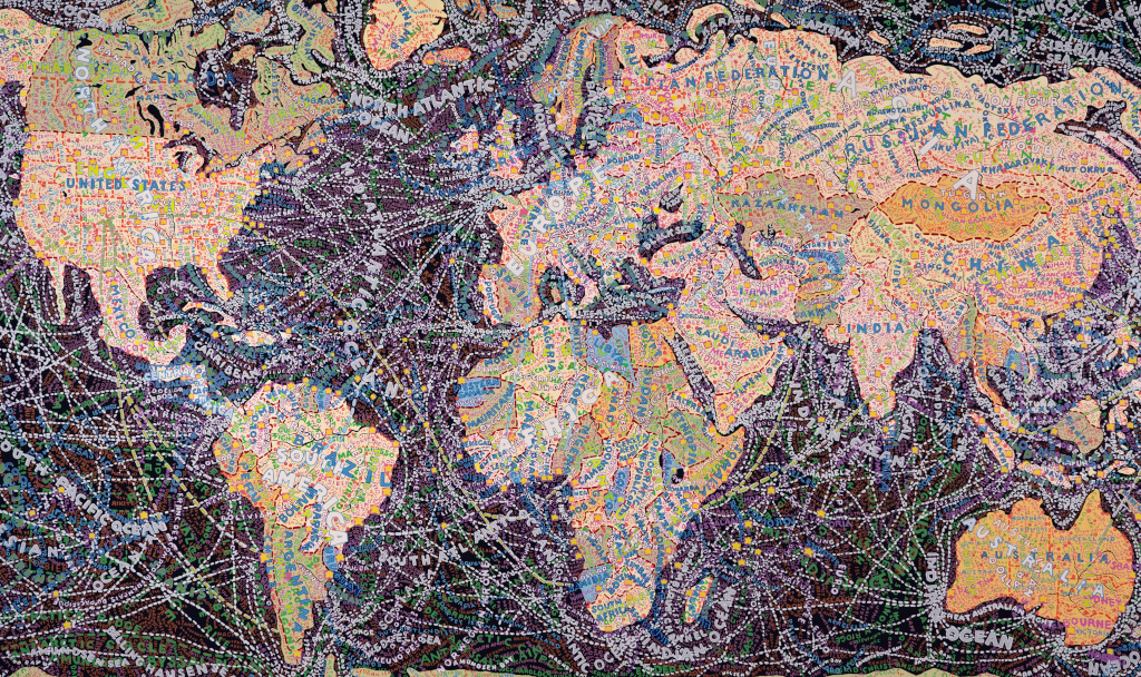
She’s even found time to carve out her own personal fine art career of fascinating hand-painted maps that echo her own father’s incredible career. More on that later. Paula got her start briefly at Random House Books before working at CBS Records, followed by Atlantic Records. During her time in music, she created literally hundreds of album covers, including the now iconic debut for the rock band, Boston, with its neon looking spaceships propelled by blue flames. After opening her own studio in the ’80s with Terry Koppel, she joined the famed and overwhelmingly male British design firm Pentagram in the early ’90s.
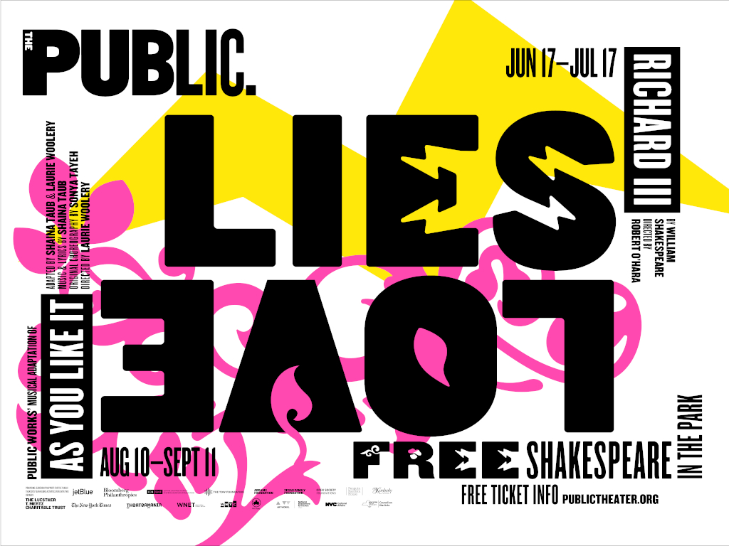
She helped launch the New York Outpost, and thanks to her talents along with other greats like Michael Beirut and thanks to its unique management ethos, its fame and influence continued to rise. The incredible firm has recently celebrated its 50th anniversary. During Paula’s time at Pentagram, she’s produced incredibly influential works, none probably more than the identity and posters for the public theater in New York. Paula’s 1995 type heavy poster for the public’s production of Savion Glover’s Bring in ‘da Noise, Bring in ‘da Funk was a master stroke. It was powerful, memorable, and above all, it was cool.
As someone who moved to New York in the late ’90s, it’s hard to overestimate the project’s impact on the cultural fabric of the city and the evolution of design. It perfectly captured the mood of the age. I caught up with Paula from Pentagram’s office to talk about how she collaborated with some of the biggest bands on the planet, what makes Pentagram so special, her first hand-drawn map, how her husband, famed illustrator and designer Seymour Chwast taught Paula about typography and just what good graphic design even is.
I wanted to start a little bit at the beginning, because obviously, we have a lot of territory to cover. Your father was an engineer who worked on technology and maps and was an engineer, right?
Right. He was a photogrammetric engineer and a scientist and an inventor.
I see.
He was coordinator of nations mapping. He worked for the government.
I see. Were there any big maps that he had worked on?
Well, it’s more than that. He was what’s known as a photogrammetric engineer and he, as a young man, was working on the Tennessee Valley Authority. They were damming the Tennessee River for electricity. This is at the end of the Depression. He said that he was dynamiting areas following a map that was given to him. All the positions for the dynamite were wrong and they were all wrong by the same amount in every area. He was dynamiting.
So, he realized there had to be something wrong with photography that he was operating from. It was aerial photography and he realized that the lens of the camera was not compensating for the curvature of the earth as it got higher or lower. That was what was causing the distortion. So, he worked out a mathematical formula to correct lens distortion in aerial photography. Without his invention, there would be no Google Maps.
Oh, gosh. Wow. Well, thank you to your dad. That’s quite the contribution.
Yeah, he got a $1,500 check for the government. I have a photo of it and he was promoted, but those were the days when civil service was a different place.
Absolutely. Growing up, was it the household where that post-war age of people enjoying home photography and the eventual emergence of the Polaroid, the early Polaroids and things like that? Was yours a household that was creative in that way, like people making films?
Well, my father always took photos. Mostly when I was in high school, my parents took a lot of European trips and my father used to brag that his photos would be perfect for postcards and travel ads. He would photograph my mother in every shot to prove that it was a real personal photo, not a commercial company doing it. He was very egotistical that way.
I read that you originally studied illustration before moving on from there. Were your parents supportive of that?
No. My father thought art was dumb.
I mean especially if they’re the type that traveled to Europe where they must’ve had some appreciation for art or I guess maybe just not for their own daughter maybe.
Well, my father thought serious people became scientists, not artists.
Was there a particular science that he was trying to push you into at the time?
Well, I was terrible at math and so I think he perceived me as a huge failure.
What drew you to illustration?
Well, when I went to Tyler, I knew I wanted to be an artist of some sort. I didn’t know what sort and I tried everything. It was really a terrific school that way in your first two years, you experimented with all kinds of things and there was drawing and there was painting. There was something called basic design that I was terrible with, because it seemed about being neat, that the goal of the design was to do something that was very organized and neat and I was sloppy. Then in my junior year, I took something called graphic design and that was totally different. That was about ideas and that’s when I got hooked.
When you first started working in design in the ’70s and obviously you’re someone whose work is so synonymous with New York and the identity of New York and the feel of New York and the emotions that are connected to New York, the ’70s were a dark time for the city and a very gritty time. I’m curious as a young designer, what was that like working as a graphic designer in a talent at the time that was known for being gritty and dangerous and just very different from what it is today?
Well, it was much better, I think. I liked the grit and I liked the danger. It was very exciting for a young person and I think that there are a lot of people I know from the ’70s have huge amount nostalgia for things like the kind of club life there was and the notion that you could create your own social orbit and you could find your own milieu and the people you wanted to know. I was in the music industry and it was incredible. I started working at CBS Records in 1972 first in the advertising department. I was hired by Atlantic because an ad I worked on there. In Atlantic, they did record covers and ads in the same department. So, I started designing record covers when I was about 24.
By the time I was working there a year and a half, it was 1974 and I had designed 25 record covers and they won awards. So, I was hired back to CBS, where I worked for the rest of the ’70s into the early ’80s. I was East Coast art director and I made about 150 covers a year or oversaw them depending upon how they came in. I didn’t even know I had an unusual job. I thought everything in New York was possible.
I mean 150 covers a year sounds really high. Do you remember it being quite the factory to be able to do that amount of work at the time?
Well, I had roughly three covers a week that I was working on simultaneously. Some of them, I designed, meaning that I actually made the covers. Some of them, I art directed, meaning that I set up photo sessions and hired illustrators and put the type on covers. Some of them were covers that came in from Nashville that had to be re-mechanicalized for some purpose in New York. There was just a mix of things that I did and it was active all the time and very, very creative.
Though I didn’t know I had a very special job. Years later, and remember all this was before there were computers, so we were actually making stuff that you would blow up things and paste them onto record covers and they would be C prints, this photography that you used for comping. I would hand paint the top on a piece of prepared acetate to show the recording artists who all had contractual cover approval. They were my clients essentially. They came in and they had their opinions. You redid things.
Sometimes they hated it, sometimes they liked it, sometimes they didn’t have any say at all because they were dropped from the label. It could be all sorts of things like that. It was amazing, but I didn’t know that it wasn’t real and that it wasn’t a normal thing that people did or didn’t have that experience. As a designer, I had a very unusual young period of my career and I think that what I learned from it was that everything matters and that craft matters the most and ideas generate terrific projects but don’t necessarily result in something terrific unless the craft is right.
I’m curious, that must’ve been such an amazing training ground for any young designer to be working on these covers. Do you feel that you learned how to work with clients in that way because you’re dealing with who could be more particular but yet also removed from the realities of graphic design than musicians from the ’70s, right? I mean, did you learn anything about how to handle clients in this trial by fire, I would assume?
Well, yes and no, because the client relationship is very different today. I mean, I would be dealing with recording artists and the recording artists had total say. So, there would be project managers who would bring them around to meet me and they would sometimes participate in a discussion or the band’s management or maybe even their wives would come. But the reality was it was a very limited form of approval making. You would work directly with a person whose record cover it was. If they liked it, it went. If they didn’t like it, you’d redo it and now it’s much vaguer. I work for corporations. There are myriads of people involved. There are all kinds of hierarchies and levels. I have to negotiate my way to the appropriate decision maker.
Sometimes they set up hurdles to prevent that. It really depends upon the project. So, corporate behavior was very different from those decisions. Then of course, there weren’t marketing executives. They didn’t call themselves marketing executives. Most of the people that handled the marketing in my early days in the record industry were producers of the music or somebody who might be the band’s manager, but they were never marketing experts. Nothing was focus group tested. I made things that went out of my desk and went all over the world and often sold billions of copies and are still in existence with really one approval.
Which is incredible when you really think about it.
That’s absolutely incredible. I don’t even know how that was possible now, and I went up to Sony Records after Sony bought CBS. Maybe I was out of there about 15 years or 20 years. I can’t remember how long. Of course, when I worked at CBS, there were no computers. We set typography that was done by outside typographers and it would come back on a sheet of paper and you’d cut up the type and put it on a mechanical. There was a mechanical room that did that and I made those 150 covers a year. There were about 35 people in the art department.
I went to Sony and there were about 100 people in the art department and they all had computers. I said, “How many covers do you make a year?” They said, “Oh, about 150, same amount as me.” But they didn’t do librettos for operas and they didn’t have open up covers. They were really making CDs. I thought, “What are they doing with all that extra time?” I realized what they were doing. They were making changes.
I’m curious, obviously, an accidental hit was your Boston cover, which is an illustration of course too because for a graphic designer that also makes it a little bit unusual. I’m curious, is there one musician you wish you could ring up whether they’re alive or dead and work on one more cover with them?
Muddy Waters. He was so charming and he was so delighted with the things we did together and I just have such happy memories of working with him. I remember Richard Avedon shot him for one cover and he walked into Avedon’s office. He was wearing a hat and a coat. Avedon saw him and just said, “Stand against that wall.” He pushed him against the wall, took six big photos of the guy, which we saw instantaneously and the record cover was done. I mean he had so much character. He was a natural. Then there were management companies I worked with.
I really liked working with a guy named Steve Paul who used to have a place called Steve Paul’s Happening. He was a manager of Johnny and Edgar Winter and Rick Derringer and young David Johansen before he changed his name. He just required excellence and he was just wonderful to work with because he trusted me. I did some beautiful work for him. Then there was Bob James and I did a series of jazz albums for him that are classics. I think they were 19 and all. They were all big objects blown up at scale.
The more I think about it, the album covers are one of those artifacts from graphic design history that are all kept and collected. Whereas so much work from back then is not kept and collected. I was curious because I watched your episode on the Netflix show on Abstract and I saw you had this incredible archive where you had really seemed like a lot of different pieces. I’m curious, where is that archive and what is it like?
It’s not exclusively mine. It’s the New York Office of Pentagram’s archive. I keep my old record covers there and public theater posters are there and things that we save. If there are actual physical objects, very little is a physical object anymore, but when it is, it’s stored in the archive and then of course there are also files in our archive. Most everything I’ve done is there. When I have shows now, I go there to reclaim the work and find out what I made because I forget.
(SPONSOR BREAK)
When it comes to type and this power of type and people that obviously have read anything about graphic design, any layman, thinner fonts might mean something more traditional and more elegant or Serif versus San Serif, I’m curious in your experience and would love to hear from your own mouth, why do you think that is? What about the human condition really responds emotionally and intellectually to the way in which we arrange letters?
Well, largely because we read and that we recognize and that reading and recognizing are really different. You read text and some people find Serif texts easier to read and some people find San Serif text easier to read. It really depends upon the font, but in things that have one or two words that might exist on packaging, or they may exist in posters or they may exist in digital media, you get an impression of something and you get an impression of something in terms of how you recognize the type.
You might’ve recognized type to be, for example, trendy or bold or deliberately ugly or challenging in another way, or you might find it to be graceful. You might find a logo to look important or to look stylish. These are associations we make from seeing things that are similar, that they are connected to something that help get that font to develop that form of recognition and that the way you understand something is a visual language. Does that make sense?
Yeah, absolutely. No, I mean I guess I’m thinking why the brain attributes certain aspects of a typeface to…It’s probably cultural. It might be a little bit primal. I’m not sure.
No, I think it has to do with repetition and expectation. As I said, recognizability is really the goal of what an identity designer does. It’s easier to understand when you think about marks. If you saw the Nike symbol when it first emerged, it really did not look like a power symbol or a sports symbol. It looked like a really bizarre check mark. Then over a period of time in relationship to Wieden+Kennedy’s brilliant promotion in advertising, you began to associate it with sport in such a profound way that you can’t escape seeing that and not understanding it in connection to that product. That could just as easily be typography.
It doesn’t have to be just an abstract mark, which that was, which makes it great because it’s a language that doesn’t need a logo, but that is their logo and that the logo is form. So, that when you see forms like that, you would make an association to Nike. You would think, “Oh, that looks like sport,” but initially, it didn’t.
That’s curious. I guess now that I think about it, the swoosh is the only logo I can think of that has its own name. Everyone knows what the Nike Swoosh is even without describing it in any way or looking at it.
Well, calling it a swoosh is part of the arrogance of the design and advertising aspect of it, because the fact of the matter is it isn’t necessarily motion. It just looks like a check mark. Swoosh sounds like you’re going to get the basketball in the basket and that’s the swoosh sound. That’s what your expectation is. That’s where it comes from. That’s from an advertising campaign. That stuff works.
Going from the commercial to the personal when it comes to your hand-painted maps, for those who haven’t seen them, I’m wondering if you could describe them, how you would describe them to someone who’s never heard or seen them before.
I paint maps of places that are real and I paint in information and the information can be roots and roads, but it’s also things like demographics sometimes or sometimes I may characterize something in a sardonic way. A lot of them are critical. They really give you a picture of the world, but a picture from my point of view. They’re editorial. They’re very editorialized and I call it all the news that fits. It’s my view of how I see things and how I think about the world.
How long have you been doing them and how many have you done to date, you think?
Well, I was painting fractured satirical idea-oriented things for a very long time. I started doing that actually when I think around the end of my stay at CBS Records, I was drawing crazy diagrams. I made things like that for my husband’s magazine, the Pushpin Graphic. Then I started creating them for graphic design relating projects. I made a genealogy chart of typefaces for print magazine that was a joke. These sorts of things were sardonic and some of them were funny. Then they started to get serious, and I began painting them bigger.
They used to be on little chipboards, and I was painting with temper paint, and then all of a sudden, I realized they’d be better big and I started doing great big canvases. My biggest canvas I think is 10 feet by 14 feet is a painting of the world that’s at that scale. Mostly they’re eight feet high. It could be eight by eight square or a little wider.
Your husband, Seymour, of course, is a huge part of your life and himself he had has an incredible career. The two of you don’t collaborate or work together. When you work, when you live, obviously you share a life with somebody. Is there something of him that has seeped into your career over the decades?
Well, he taught me about typography. He was a huge influence in the ’60s and ’70s. He used to draw fonts and he drew some of the most popular ones of the period when I was in art school and early in my career. So, he was hugely influential in that. But I think now where he seems less interested in typography and much more of an illustrator, I am amazed at his output and how he can continually stay creative and make things. That’s very much part of our life. So, I don’t know that I would’ve been painting if I hadn’t been married to him. I think I would be working, but I don’t think I would’ve been doing the dual thing that I’ve done for the past 20 years or so.
You had a recent show in London at Sims Reed Gallery that was called Data Isn’t Neutral. I’m wondering if you could explain what that means and how that relates to these maps.
Well, I think that people think that data is scientific, and that if you see something displayed in a statistic, it’s accurate. It isn’t. People create the data. Look at what just happened in the last election that the Republican pollsters put out information that was in no way inaccurate. Then, people who took information from those pollsters, like 538, just made completely inaccurate diagrams of how people were going to probably vote and were way off more than I ever remember. You have to realize that data is selected. People make a decision of how they’re going to gather and select the data, and that means that they’re not necessarily impartial. It’s very hard to be impartial.
There’s always a way to view something in terms of making those decisions. So, I decided to be just outrageous about it. There’s nothing impartial about my data. It’s my data. I picked it. I use it. I leave out what I’m not interested in. I totally control the data.
What’s a good example of some data that you added to a map that you feel is inherently yours or in that sense?
I think it’s more what I leave out. In other words, I draw things from information that may or may not be accurate. State populations change all the time. How they voted may be counted differently in different precincts. Things aren’t necessarily quite in the right spot. I may have a statistic wrong, I don’t correct it. It is a pile of information and I would say you can get an impression from the maps and they’re right.
Are you a Steve Kornacki MSNBC election map aficionado? Do you like looking at all that stuff?
No, I actually can’t stand watching him if you want to know the truth. He makes me terribly nervous.
Well, that’s probably his job being done. It is somewhat hypnotic and also nauseating at the same time.
Exactly. I find myself just getting very nervous and uncomfortable about the potential of the decisions. I mean, I think it’s interesting about the territories though. I mean, I like how he analyzes an area and how they’re going to vote and why they vote that way, but it misses something. I think that what was incredibly missed in all analysis of the vote in this past election was really the position of women in general and racial relationship to abortion where they had a right taken away and it was absolutely outrageous.
No, sometimes the economy is not more important than that and the fact that they totally discounted young people who were voting for the first time. Good luck, Republicans, because they’re likely to vote Democratic the rest of their lives. So, I mean, I think those are big misses. That wasn’t in the polling at all. Apparently, they thought the abortion thing was going down and it didn’t.
Are you someone that watches anything political and think, “God, I should have designed that poster. Maybe this election would’ve gone differently”? Maybe if Hillary had a different thing or if Barack Obama’s announcement or if the Inflation Reduction Act may have been communicated slightly differently with maybe a really great poster.
No, I don’t think that actually. I don’t think they do anything. I think people remember them, but I don’t think that they necessarily change votes. Yeah, I think the people who like the message like the poster. I mean, I hate to sound so cynical about it, but I’ve seen posters become very popular that I actually don’t think are very good. I don’t want to have to mention them, so don’t ask me. Then there are posters that weren’t popular that were terrific, that did very little. So, as somebody who actually judges the quality of the poster, just separate from how people respond to it, I just don’t know that what you do that could be great necessarily will move somebody.
(SPONSOR BREAK)
As we’re now celebrating this 50 years of Pentagram, I would love to hear your story about how you first joined the firm and why. You had your own practice that you shared with someone before Pentagram. How’d that happen?
Well, I knew a lot of the principals. Woody Pirtle and I were friends. We’d met through the AIGA board and AIGA events. That’s the American Institute of Graphic Arts. Colin Forbes, the founder of Pentagram, was president of AIGA when I was on the board. I was a very young member of the board. I think it was 26 or 27 when I first got on the board. That was when I was still in the record industry. As a matter of fact, I wanted to leave CBS in the early ’80s because records were turning into CDs and I wanted to go out on my own and I was really nervous about how to do it. Colin actually advised me and gave me some courage then.
I knew also Michael Bierut, and I’d also met him through AIGA. So, that we joined at the same time and we had the same connections, but I had to close down a business because I had a business called Koppel and Scher in the eighties. To join Pentagram, I had to close it down. We had hit a recession and my partner Terry Koppel was a magazine designer and his work almost totally went away. So, he took a staff job and I was running the business by myself. I was really happy when Pentagram called, though I was afraid of it because I thought it was going to be too corporate for me.
How would you describe that first day when you walked in the door? What was that Pentagram office like?
Well, it was a lot smaller then. The New York office was really an outpost of London. It had fewer partners. It was a small space in a building that was actually at a terrible elevator that was always breaking and now is where Jeff Bezos has an apartment, right? Because it’s right across from Madison Square Park, which was actually a terrible neighborhood at the period I moved into Pentagram. Three years later, there was a small building for sale at 204 Fifth Avenue down the block from that loft building that we bought together. We sold it about right before COVID. I would say that office was feisty and we were not as famous as the London office.
Nobody knew who Pentagram was in New York at that particular point in time, but it had a very well-grounded reputation in London. There were famous partners. Colin was one of them, but he wasn’t as famous in the States as he was in London. So, they were still building their business. The two major partners, Colin and Peter Harrison, Peter was an expert and Colin was still British. They didn’t build a New York office until Woody Pirtle joined, but he was from Texas. So, when Michael and I joined, it became a New York office, and we began doing things that were related both to New York City.
I joined in 1991 and I worked on the American Museum of Natural History, the New York Times Sunday magazine, and the public theater all around the same time, the public theater being in 1994. So, Michael was also doing cultural work in New York. He worked on BAM. Then we began to have a New York cultural reputation and it grew into a much more commercial graphic design. Pretty soon, we were doing everything.
When you say it was feisty, how so? What was feisty about it?
Well, we were upstart. We were essentially a young company with young partners, and London was much more established. They had a broad history. When you went to London, you saw work from Pentagram everywhere. Now you see it in New York, but you didn’t then. Nobody knew what Pentagram was if you were a New Yorker. Jim Bieber who was an architect, joined and began building restaurants that people knew and people began to recognize it. There was synergy in the group, and the group grew.
Pentagram is known for its organizational structure being very unique and how it’s run. Was that always the case from the very get-go when you first joined and was that a part of your decision?
Absolutely. Pentagram is the largest independently owned design firm in the world. There’s no other firm like it, though many try. It is an organization of designers. The principles are designers. Every now and then, there may be one who’s a writer, but for the most part, they’re designers and they want control of their work and they want to do their work. Each partner operates a team, and the team can be any size. It can be any size that they choose to make the work they want to make, and they can work with those clients they want to work with.
The goal is to be profitable and to be able to do your best work, and that you select the partners based on the work they do so that you’re picking the best designers to join. You try to get a reasonable differential in the talent. So, the business stays broad, but the goal is that if everybody comes to the table and they have to be say equal and say equal means that somebody may make more money than somebody else, somebody else may have more of an outer reputation, somebody else may be more of an inside player. You may have different types of clients, but that collectively, you’re equal.
Was that refreshing at the time when you joined? Was that a big part of you joining Pentagram was the structure?
Well, I liked the structure. That was attractive to me. When I joined, I was the only woman partner and a whole group of very male men, particularly the British guys. I mean, I used to hate actually international partners meetings. Now, I love them, but those guys were intimidating and they weren’t all that nice if you want to know the truth.
Yeah. Did they treat you well? I mean as the first female partner, did they treat you in a way that you thought was befitting at the time?
No. No. I felt like they were dismissive. I didn’t feel that way so much in the New York office. I felt that way pretty much internationally.
Was there a project that you did that you think changed the way they perceived you, or is it just time?
Well, it’s interesting. The project that they were very critical of and walked out when I showed was my identity for the Public Theater.
Really? Did they try to persuade you to—
They thought I had committed typographic, blasphemy. I mean there was nothing could do. I presented it at a partner’s meeting. I still remember where we were sitting. It was someplace where I don’t think we had a proper screen and there was a sheet thrown over something. The work was projected on the sheet, and we were sitting with tables, dining tables. I think it was maybe a tablecloth that was over this thing. I remember that they were very dismissive of the work, and some of them got up and left.
Oh, gosh. Did you eventually get an apology from any of them?
Never. Too bad for them.
Too bad for them, exactly. They owe you an apology for sure.
They were an arrogant lot. I mean, they were really talented and I learned a lot from them, but they were very male and very British.
What about that Britishness that you think is maybe even today essentially woven into the Pentagram DNA? Is there a Britishness that is still present?
Well, the organization is so much more diverse. The original Britishness to call it that, just as my sense of them being arrogant, I think the arrogance is pretty much gone.
Do you need even a slightly small bit of arrogance to be a good designer?
Well, you have to believe in your own rightness of choices. So, I guess that’s true, but I think that the arrogance really had to do with general male behavior anyway. I mean, these guys were 17 years older than me. They were friends with Seymour and the group in the States. Some of them were equally arrogant. They thought they were design masters and they were. They thought their views were what mattered and that if you did something different, it was blasphemy.
I remember Peter Saville was a partner in the London office, and he experienced the same thing I experienced because we were more or less the same age. He was actually a very, very, it still is, a very famous, very highly regarded designer, and it was not a good experience for him. I remember that totally well. So, that had to do with just the nature, I think, of that generation of men.
When it comes to perhaps some recent projects, I’m wondering firm-wide, it could be anywhere in Pentagram, I was wondering if there’s any that you think came out in a way that are truly unique to Pentagram? Meaning that you couldn’t really see them being executed in another firm in quite the same way.
I think that it’s not the specifics of the project, it’s more the scale of the project. I think that what Pentagram has, because it’s multidisciplinary, is this executional ability to do things on a much broader scale, because it often is moving from form of logo to animation of logo to building. I mean that these things really move. I really don’t think other firms do that as well. Some of our competitors who are very good, like Wolff Olins or Collins, don’t really do environmental graphics or work with buildings. So, they can have the same relationship we may have with institutions where we do it all.
With a lot of people that listen to this podcast in particular, are in the world of art or design or the cultural fields. How does Pentagram yourself but also the firm, how does Pentagram decide on which clients to take on and how that process works?
Well, it depends upon how slow or busy we are. I mean, I think that we attract the kind of clients that feel that we work appropriately in their milieu. That is both good and a trap because it means a lot of the work can be repetitive, that you’ve done this job 20 million times and you’re sick of it and really should go to somebody else who’s never done it before. On the other hand, because there are so many of us and we do so many different kinds of work, I know I got an opportunity to really grow here. I’d never done anything that was three-dimensional.
When I was working on the Public Theater, the building architect was a man named James Stewart Polshek, who died recently, brilliant architect. He saw my identity and he was charged with redoing their lobby where there was no budget. He decided to make it all graphics, and he handed me an architect’s plan and told me to design my identity into these series of banners and put them up every place. I didn’t even know how to read the plan, but I began working, and then did a couple of other projects with him. Because of that, I’ve been doing that as a serious part of my business for the past 25 years with all different kinds of people and it’s been fantastic. I love that work and I really owe that part of my career to him.
What part of that kind of work appeals to you, you think?
Well, there’re frustrating parts, but it’s really what the creative process enables you to do if you figure it out right. If you make a book jacket and let’s say you design the book jacket and it’s going to go to print in six months and the sales department is still looking for copy lines for the back and the front of the book and they’re going to put the author’s name, but maybe there’s somebody else’s credit or they decide they’re going to put a quote on the back, the book jacket will come out six months later and look nothing like what you designed because you’re not there to control it. If you work on a building and you do, let’s say, added a typography for the building and you do a whole plan on the inside, you make murals and all kinds of things for the building.
You make a Photoshop rendering of it to present to the client, and the Photoshop rendering is cost…The cost of it is amortized, and you know exactly what it’s going to cost. It’s within the building’s budget. It may be three, four years later, but it comes out exactly like the Photoshop rendering and that is spectacular. It never fails. I can show it to you on every project I’ve ever designed. Either it doesn’t get made at all because it was too expensive or it’s exactly like the Photoshop rendering.
If there were some projects now in this 50 years, perhaps outside of your own portfolio that you feel were instrumental in building Pentagram to what it is today, are there are a few projects that you think you can point to that are outside of your own that you think are pillars in a way?
Oh, God, I have to have everything in front of me because everything flies out of my head. The reality is that Pentagram is strong in probably every possible area of business. We did enormous financial institutions well, and these things last from, I guess, Lloyd’s of London to City to MasterCard to the more contemporary digital banks that the partners are doing now. I mean, it’s just a broad area of practice that is so much better than what else is out there. Then you take museums as a group, and we’ve done so many from the V&A to the most contemporary museum that is going on right now, like the National Gallery that my partner Michael Gericke did or Abbott’s work with the Kennedy Center, which is breakthrough.
I mean, these things go on. In the movie industry and my partner, Emily Oberman, just kills it all the time. What she does is elevate the expectation of what logos are. The way my partner Dom Lippa does the London Design Festival every year. I just think it’s astounding. It’s a 20-year body of work that’s amazing. Harry Pierce did Liberty of London. He understands retail better than anybody I know and brings real art to it. So, that all of them have something that they do incredibly well. My partner, Natasha Jen and Eddie Opara, are terrific equally in fashion and technology. Really amazing.
I’m curious, we talked about your time at CBS Records and at that time in graphic design and how analog things were till today where so much of design is digitally driven and guided by all these forces. Do you think that all this technology has made graphic design better, or do you think if you were a young designer today that you would still be interested and fall in love with graphic design in quite the same way if you were now having to be in a purely digital world where everything is just Adobe Creative Suite?
Everything is an Adobe Creative Suite, actually. This is the best period ever for typography there ever was. The designers today, and we do it every five minutes. We customize and redraw typefaces all the time. It’s a true revolution of it. You create whole bodies of visual languages for individual companies by allowing them to have their own font that you can recognize. This really takes you back to what I was talking about with Nike. You can recognize a letter form and understand a whole company. That’s amazing. You couldn’t do that. I mean, Seymour used to do it. He drew a lot of fonts when he was working in the ’70s. He just couldn’t do it so instantaneously.
Is that because now there are new technologies that makes it easier for clients to have their own typeface or is it about a backlash?
It’s about designers understanding form and the technology enabling the designer to create the form and also to program it so that you can have a bespoke font. The type companies to a degree, I think, enforced this, because they changed their rules and they gave up working in partnership with designers. What they do is they charge the clients if you use one of their fonts and you design with it. The client has to repay a licensing fee every three years for the use of the typography. That becomes very expensive because you’re paying for something that you may have purchased when you were a small company, and then you’ve become a big company and you’re paying them over and over and over for the use of the font, but not for the use of the design.
There’s something really wrong about that. I think that what’s happened is partially there’s a love of typography and the software that enables young designers to really create their own fonts. Then I think there’s actually a little blowback to the way that the type business has begun to run itself, and they’re no longer compatriots with the designers. They become competitors and enemies.
As my last question, if I asked Paula Scher what is good graphic design, How would you answer?
Oh, shit. It’s a hard question. I think that good graphic design raises the expectation of what the design should be.
A special thanks to Paula Scher, everyone at Pentagram, and to Rachel Judlowe for making this episode happen. The editor of The Grand Tourist is Stan Hall. To keep this going, please follow me on Instagram, @danrubinstein to learn more and sign up with your email for updates at thegrandtourist.net. Don’t forget to follow The Grand Tourist on Apple Podcasts, Spotify, or wherever you like to listen and leave us a rating or comment. Every little bit helps. Til next time.

With an outsider’s eye, fashion designer Sander Lak is the perfect talent to bring a dynamic range of colors to a new collection of Maharam fabrics.
Designers Lindsey Adelman and Gabriel Hendifar may technically be competitors, but in many ways they’re kindred spirits. On this episode, the two impresarios sit down at the same table for a rare discussion on what being a designer means to them, how the careers of one another inspire them, and much more.

Celebrating 10 years of creative partnership with Belgian architect Vincent Van Duysen, Italian powerhouse brand Molteni&C’s latest works are ready for summer.