How One Architect Reimagined a Centuries-Old College Campus
Architect David Kohn's recently completed residential complex at New College in Oxford proves that there are still ways to bridge past and present where elegance and utility receive equally high marks.
May 19, 2025By
IAN VOLNER
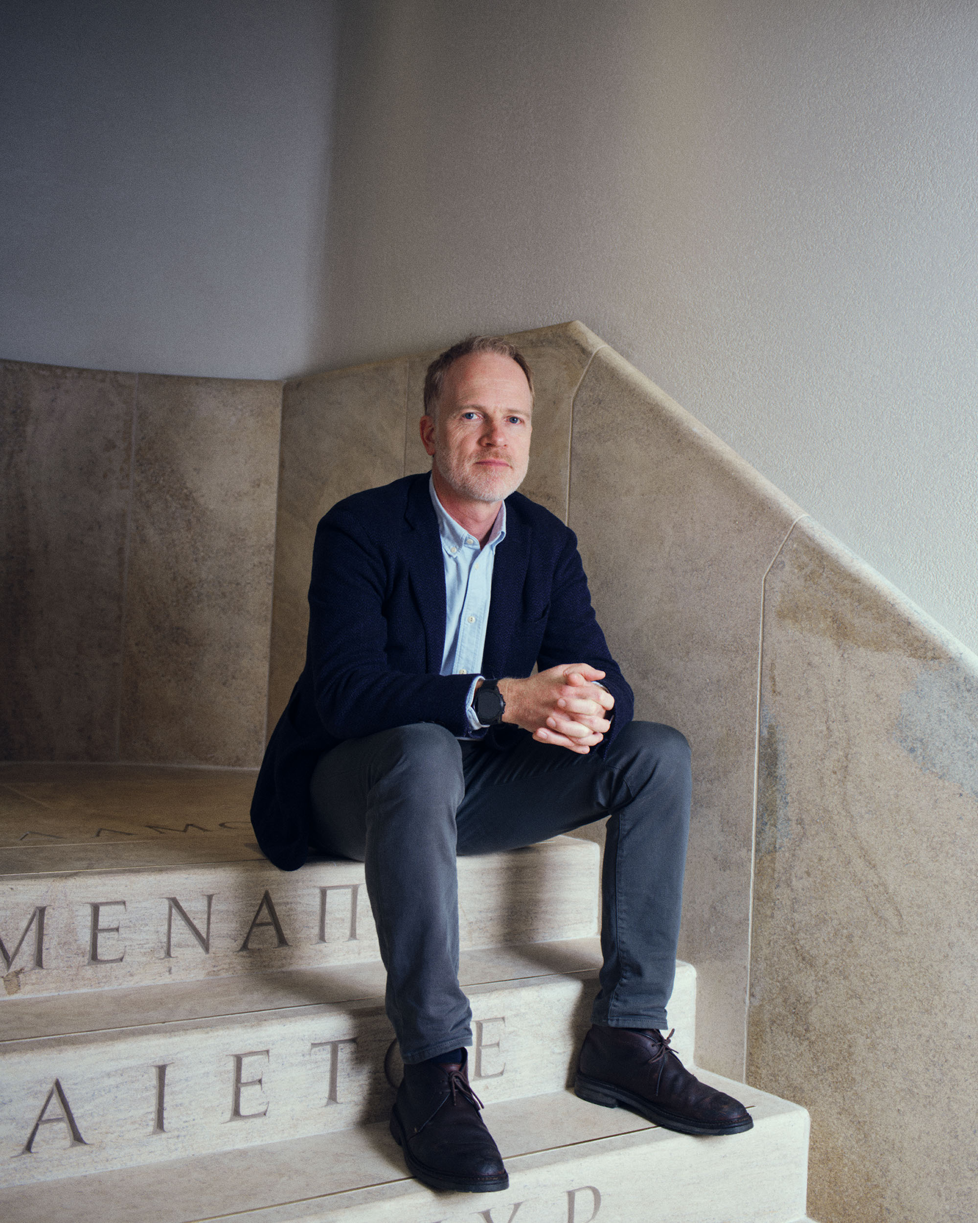
David Kohn photographed at a staircase within the Gradel Quadrangles.Photo: Jake Green
This article is from our first-ever print issue, available for order online now.
David Kohn is used to going his own way. Since founding his eponymous practice in 2007, the South African–born, British-based architect has been steering a singular course through the profession, building a portfolio of projects that can only be described as unconventionally conventional: bucking the customary technological and formal preoccupations of contemporary architecture, yet completely irreverent in its embrace of premodern norms. If that sounds a little like vintage 1980s pomo, think again—though the influence of James Stirling is pretty clear in much of Kohn’s work (in particular his preference for grass-green window frames), projects like the Lützowufer Apartments in Berlin have more the flavor of Louis Kahn, while the Ice Cream Factory retreat in rural southwest England looks like back-to-the-land Breuer. Along the way, Kohn has built an impressive and suitably eclectic list of collaborators and clients, teaming up with artist David Shrigley to create an understated space for London’s Stephen Friedman Gallery and designing a house for Loewe creative director Jonathan Anderson. Reflecting a sincere interest in materials and in process, the catalogue of work that has emerged from the office over the past 17 years is also remarkably lacking in pretension, charged with a love of history and a ludic embrace of image-making for its own sake; as Guardian critic Rowan Moore noted, Kohn is “scrupulous, serious,” yet nonetheless “allows his imagination to wander.” Roaming around his private creative landscape, I got a privileged glimpse of his latest and largest project to date, a new residential quad at Oxford.
The Recital Hall at New College. Photo: Jake Green
Here’s a daunting request: Break down, as briefly as you can, the central concern of your practice as you see it. I’m very interested in discussions around the character of architecture, what people think architecture means, what emotional impact architecture can have. I don’t see that issue of emotion as being either off-limits as a conversation, or that there are hard and fast rules one has to play by. So much of the history of architecture is a series of dogmas: Modernism was the most recent, and it imparted this sense of what is correct, what is universally bettering. A large part of the last century was concerned with that paradigm, but there were also practitioners with a sense of an “other” architecture who carried on through Modernism, who expressed more of a regional influence or who insisted that the ideas of home and of even kitsch were good things. You see bits of that even within mainstream Modernism as well. I like it when a building makes people think of architecture not just from other times but other places. One of my favorite books is Anachronic Renaissance, by the American academics Christopher Wood and Alex Nagel: They have this conception of the architecture of the Renaissance as belonging, in the minds of its creators, to neither the fu- ture nor the past. And for me there’s something interesting about that. I would like to think of our work as syncretic, all the parts working to- gether, not as a patchwork trying to catalogue the past. Certain types of postmodernism were certainly interested in quotation, but that’s not generally what I try to do. I want people to see many things in the work.
The firm’s New College project, the Gradel Quadrangles, certainly seems to have that atemporal quality. It’s appropriate, since of course the college itself isn’t “new” at all. New College was founded in 1379 by William of Wykeham, Chancellor of the Exchequer and the second most powerful and wealthy person after the king. A self-made man, a bishop, as well as chancellor, he also created three educa- tional institutions, including the New College, where he built what was effectively the first- ever quad. Using all his knowledge of construc- tion for ecclesiastical buildings, he invented this type where all the things a contemporary stu- dent might need would be combined into one structure: a chapel, library, dining hall, offices, accommodations—all these things that might have been distributed across town, he made a single courtyard with all of them mushed into each other. The immediate precedent would have been a cloister or monastery; this was the same thing, just for educational purposes.
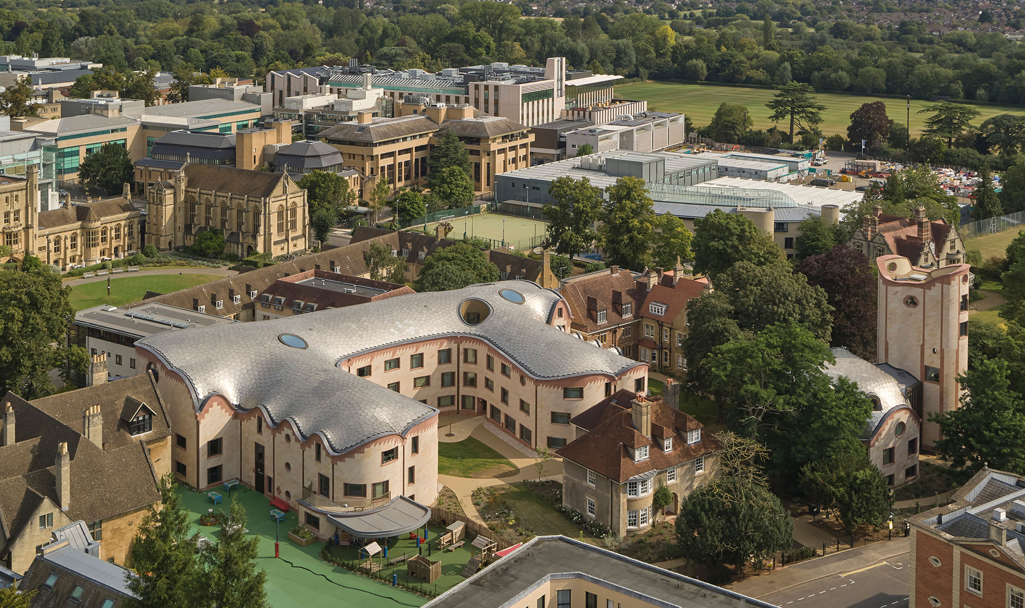
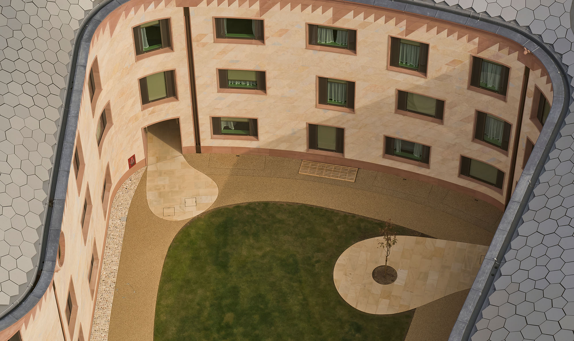
A bird’s-eye view of the New College’s Gradel Quadrangles project in Oxford, England, by David Kohn architects. Photo: Will Pryce
And then somewhere, 700 years later or so, you come in. By about 2015, the college had spotted this development opportunity to create a satellite quad just a short walk from their original home. They got support from the private foundation of an alumnus who had done suitably well, and we were one of five short-listed firms in a competition to design the project; we threw everything we had at it, and we won. While New College is one of the wealthiest colleges in Oxford, they could not give all students accommodations— they just threw them to the open market, letting them find bad flats with bad landlords. So they were suffering compared to students else- where, who were really well looked after. I was at Cambridge at Jesus College, and I have to say it was an incredibly luxurious setup; you’re given pretty much every support necessary to focus on your studies. But not, oddly, at New College. In addition, the school was also miss- ing out on a major revenue opportunity, since there’s a huge rental market in the summer for conferences at Oxford. The reality of student housing today is institutions want to find uses for it throughout the year. The 100 units in the new buildings have double beds with en suite bathrooms, giving visitors the kind of experience they’d expect in a hotel.
Not a medieval monastery feeling, then, in terms of comfort. It’s a very generous project, as regards space standards. The rooms are all around 200 square feet, very big for student accommodations. Some go down to 160, others over 250. The bathrooms were prefabbed on site and dropped in by crane during construction. Every six rooms has a kitchen that they share, with seat- ing. We had a couple of ideas about the rooms, and how to make them particular to this project: The building has a horseshoe shape, with a curved central courtyard, and the double-load- ed corridors conform to that contour, which avoids straight hotel-like hallways. All the rooms look out in a different direction, with each getting a slightly different view of Oxford. If you were a student here, you could graduate, come back to visit some years later, and have a totally different experience. And the rooms are of course only part of the program: There are shared study spaces; a music hall in the basement, which acoustically should be the best in Oxford for performances; and a suite of spaces with a bar and small art gallery. Just a lot of high-quality amenity space, all of it a short trip from the bedrooms.
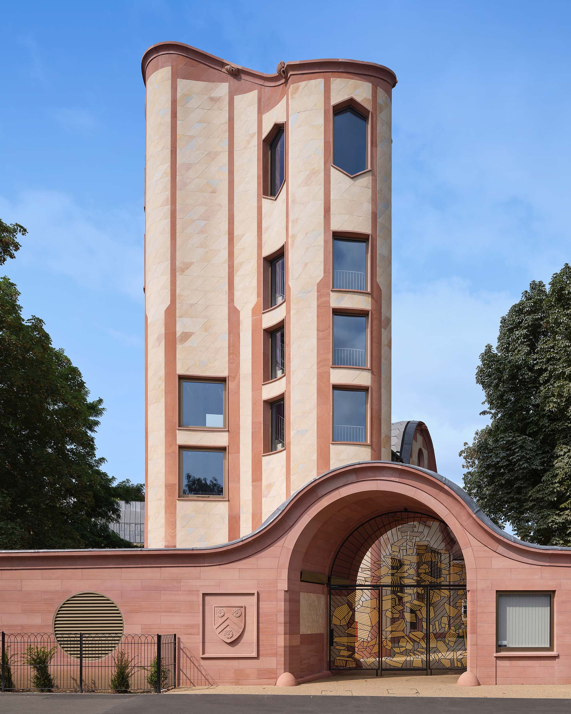
View of the project that includes Gradel Tower, which houses the Gradel Institute of Charity. Photo: Will Pryce
And all of this, as you say, functions as an ex- tension of this irregular, curving quad that surrounds it. From the beginning, we’ve thought of the design as landscape-driven. Interestingly, the de- sign hasn’t changed significantly from the competition scheme: Some of the key moves were developed in the couple of months we had between the start of the competition and the interview. It has evolved, but it’s still the same scheme essentially. And part of that orig- inal concept has always been this very strong sense of the journey or journeys we wanted people to make, a desire to provide different ways of encountering the buildings within this continuous walk. It’s like Central Park, in a way—the serpentine paths, ideal for strolling and thinking and chatting, trying to encourage being out of doors as not just something you could do in town. And that of course also reflects the traditional idea of quads at Oxford: Each set of buildings at the university has its own courtyard, which connects via other buildings to the next quad. That’s the quintessential experience of collegiate architecture: You’re in a space that is almost entirely from one era, then you go out the side and you arrive in another autonomous space from an entirely different century. When it comes to this individual quad, you have that in miniature.
Albeit perhaps with a more ambiguous sense of which era you’ve landed up in. Before un- packing that, how did guys arrive at this point in the history of the practice? We won the New College project in 2015, so arguably halfway through the life of the practice to where it is today, which is interesting because I guess it really is a considerable step forward for the practice in a host of ways. Materially, formally, urbanistically, logistically, it’s several times more complex than anything we’ve done before. We had a series of small projects at the beginning of the practice that maybe prefigured some of what we did with this one: for example, a temporary restaurant we did at the Royal Academy of Arts, called Flash. We started by looking at Pompeiian wall drawings, the kind that were common in domestic interiors during the Roman Empire. They always featured lots of references to landscape, producing this trompe l’oeil world of fictitious gardens that were built into the surface of the rooms. The building the restaurant is inside of is very classical in terms of its ordering, but we had no money, so we had to find a way to create a sense of classical order on a budget. Our solution was crates: We found all these marvelous timber crates, made in a warehouse near Heathrow, thousands of impeccable timber crates. The project became about using these very modest means to make something with a lot of presence, something that related to that sense of classical tripartite forms, by piling up these art-packing crates. Then, over the surface of the crates, we put these fantastical drawings of fantastical landscapes—not all of them Pompeiian, exactly, but various iterations of them that were more or less architectural. We created these re- ally complex rooms within rooms, some physical and the others just 2D illusions with columns, providing a sense of layering and depth with fragmentary images of gardens all around. I think what we really wanted the project to do was create a fresh new identity for Academy, but one that was also consonant with the classical villa-style design of the existing building, and with a larger artistic and architectural exploration of the exterior-interior relationship. The idea of the villa, after all, is the idea of an escape from the city to the country. Something about the opportunity to explore that history using something as novel as timber crates, and then combining that with the freshness of the drawings by artists and designers—it was a great opportunity.
New College in Oxford. Photo: Will Pryce
Right from the jump, then, the office was thinking syncretically—both in terms of his- tory, and in terms of joining together different creative disciplines. Something similar happened on another early project as well, an apartment in Barcelona. This was in the Gothic Quarter, in a 19th-century palazzo with very grand apartments that had been subdivided multiple times; the client fam- ily had bought one and turned it into a pied- à-terre, and once again we worked with a lot of local craftspeople to turn it into something new. We figured, if we’re going to do a project in Catalonia, how should we do that? We asked a local architect, and they pointed us to a family that’s been making tiles for floors since Gaudí was working in the area a century ago. The fam- ily has a factory a 40-minute drive north, where they make these extraordinary encaustic tiles: colored, patterned, tessellated to form larger patterns. Bringing somebody in like that—tak- ing pleasure in that kind of skill, and not being prejudiced about where that skill resides— that’s something we think helps to ground a design in its particular locale, as it certainly did for that project. Funny enough, on the temporal front, the apartment happened to be located on the Plaça George Orwell, which was renamed in the 1980s after the British political writer who famously had fought in Catalonia during the Spanish Civil War. So here I am, a British architect, doing a project in a place that’s assert- ing its cultural and regional identity by way of a British writer: a nice historical alignment.
The investment in materiality, in craftsman- ship, definitely appears to be a throughline to the Oxford project. One quite conspicuous connection between the apartment in Barcelona and the college is the presence of geometric tiling: At New College all the façades are made of the same tile, the same geometric form, a thin sheet of material, which in fact is load-bearing—these 70-millimeter blocks that actually all the load is transferred onto vertically, as in a tradition- al masonry building. That’s unusual, given that stone these days is mostly thought of as a luxurious external cladding, held off of the wall; here it’s part of massive construction with com- pressive joints, the wall tied back to the structure, each component a diamond-shaped slab cut on a curve. The same tiling approach, in a different material, extends to the roof, which is composed of polygons that we ran through an algorithm to determine how many sides they should have, their size and so on, to ensure that they could cover the molded, curvilinear roof- line. I just saw that it snowed on it for the first time. It looks great. All the difficulties and the joys of that tiling approach, it does tie back to the apartment in Barcelona, and to a long-standing interest in geometry. When I was a student at Columbia in the mid 90s, I had quite an obsession with geometric tiling: I was fascinated by jigsaws, how they’re made, how you can use one mate- rial and one unit to make an infinite number of types and surfaces. But geometry also carries meaning, going all the way back to Western cultural ideas about representation of abstract things like the universe and cosmology—all those tiled floors built by Cosmati masons, those were intended as sacred geometries gesturing toward some unearthly state of perfection. And then there’s a contemporary mathematical discipline around tiling as well, since it’s a key part of digital image-making: the way compression happens in JPEGs is a function of tiling. Another one of those transtemporal elements.
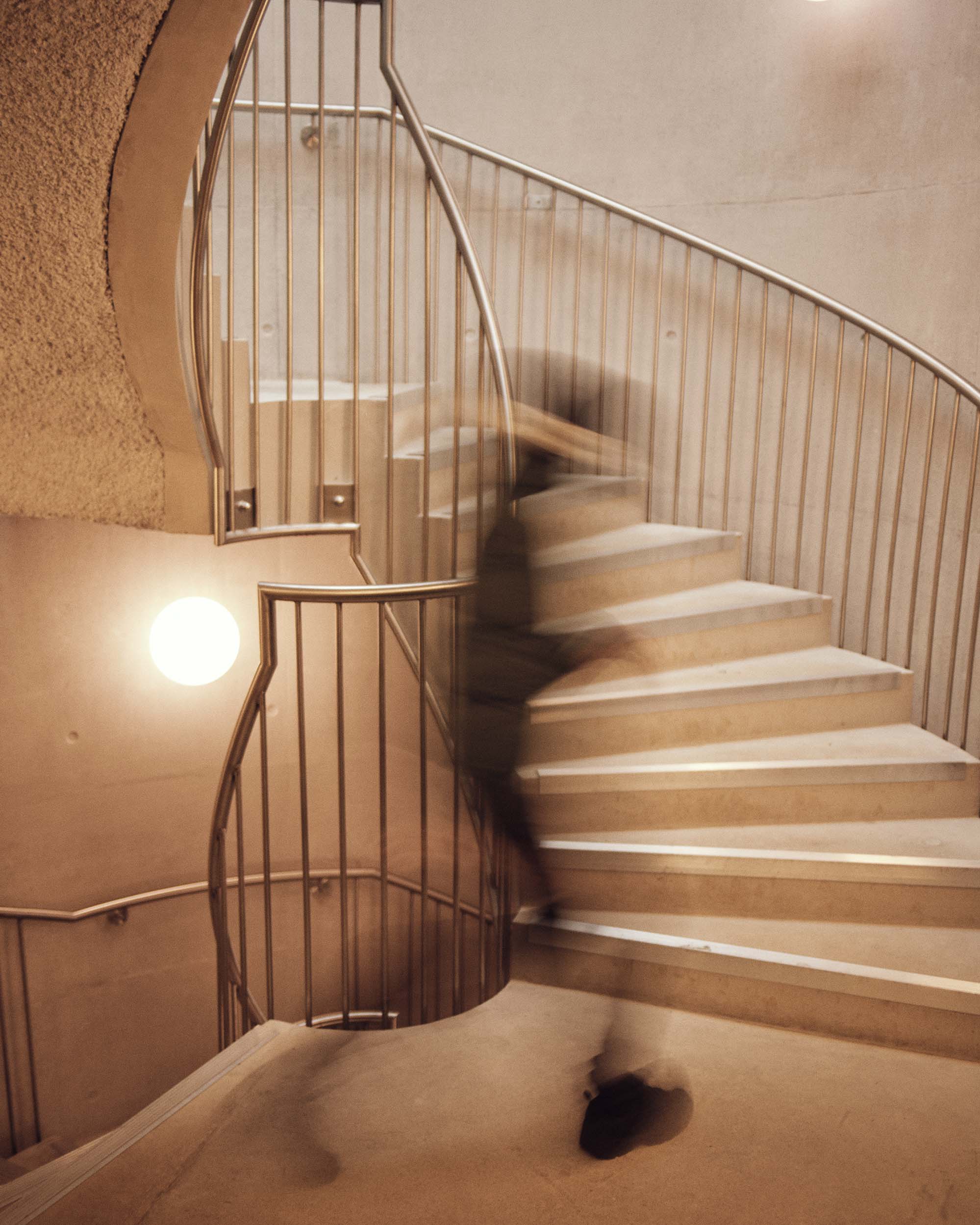
A staircase at New College. Photo: Jake Green
Color—in the firm’s Red House and Design District buildings, and even in the subtler hues of New College—also seems to be a m jor theme for the practice. How does that play into your thinking? This is a bit nerdy, but with New College, while you do have the buff and reddish portions of the limestone, where it’s oxidized, if you look closely you’ll also see touches of blue here and there, which is the original color of much of the material when it’s first quarried. With the first two projects though, the particular colors there are green and red—and a lot of people do say, “Oh, is it Stirling green?” And in a way, yes, there is a connection between Stirling and me: I grew up in Leicester; his most famous Modernist building, the University of Leicester Engineering Building, is there, and it features a lot of red brick, and his later work also uses a great deal of green, though not so often the two together. What I like about those colors, simply, is the strong contrast. They’re signal colors, very graphic, and an easy way to indicate difference. The green against the red, it feels almost like there’s a kind of reverberation from the oppo- sites. They suggest strength, give the materials a sense of being “made,” but also make the final product appear almost like a drawing at the scale of a building. I think another thing I’ve al- ways really appreciated about colors is that they only work in relationship one to another: You can say this is a nice color, that’s a nice color, but it doesn’t mean they often go well together. A project we did called Sanderson House, the client said, “I don’t like one or the other particular tone,” and day after day we kept trying to change it, showing them different swatches— but colors come in relationships, you can’t swap one out without changing the entire relation- ship between the various parts. I think there’s something powerful about that sense of system, of connectedness, parts and wholes being in interplay. The colors we’ve deployed always have to do with establishing relationships between the parts of buildings, parts of the experience. It’s never color as a single defining feature.
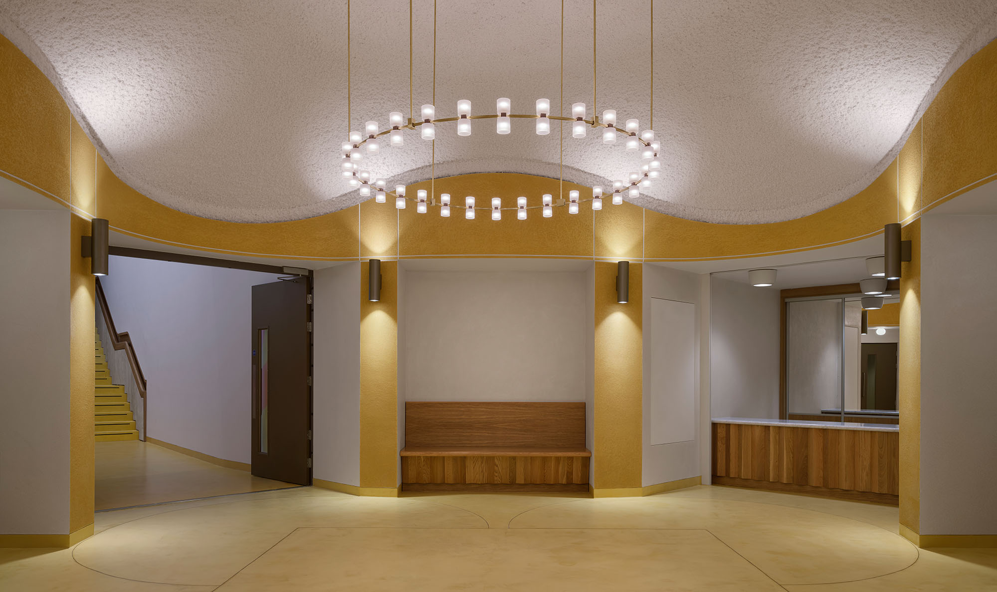
The Octagon Foyer at New College. Photo: Jake Green
Given how much of contemporary design is fairly monochrome, it also feels like color is kind of a declaration of independence. I think whether it’s color or figurative drawings or sculpture or a particular interest in geometry, a lot of contemporary architecture has tended to follow a particular 20th-century notion that the way forward is taking things away: taking away content, symbols, art. And from 2007 to now, I feel like we’ve been moving in a different direction. To caricature a certain strain of contemporary architecture, there’s this urge to- ward fashion, for the production of icons. I love Gehry, certainly, but if you think of Bilbao—the moment when the so-called “iconic” landed— there was this assertion there that buildings are removed from history, that history starts here. Buildings in that part of the contemporary continuum are not emerging from any particular typological precedent. To bring it back to Anachronic Renaissance (I have the book right in front of me), there seems to be a weakness in that 21st-century outlook, which the book is very good at pinning down. What the authors do is look at our history and the Renaissance, and suggest that truly great image-making is not about the image, but all previous images of architecture collapsed in time. The version of such and such a building type from centuries ago is present within the work right in front of you. And by extension, all future versions of the same type are anticipated in the current work. There’s an appeal to that magic, a vision of what art is. To me, there’s something more real about connecting a building from today to one from 400 years ago—the stringing together of things along a chronological line. The result can be wholly contemporary in appearance: It doesn’t have to be a pastiche of bygone styles. The present tense has cultural depth of its own. It’s just about trying to expand what architecture’s capacity is. That was something I was interested in as a student, that I remained interested in with our early projects, and that I’ve now gotten to explore on an even bigger scale with New College. Once you’re feeling free to use color, like these other things, this pleasure comes, which is both the pleasure of the things themselves and the pleasure of being freed from constraints. It’s like being let into the sweetie shop. If you don’t listen to the voice saying “I can’t do this,” you’ll find there are all of these things you can do.