Matter and Shape’s Creative Director on Why Empty Space Is the New Luxury
The creative director of Paris's red-hot new design fair makes connections between past and present, between the boutique and the iconic.
March 12, 2025By
THE GRAND TOURIST
The design fair’s creative director Dan Thawley (left) and director Matthieu Pinet. Photo: Mickaël Llorca
Welcome to The Curator, a newsletter companion to The Grand Tourist with Dan Rubinstein podcast. Sign up to get added to the list. Have news to share? Reach us at hello@thegrandtourist.net.
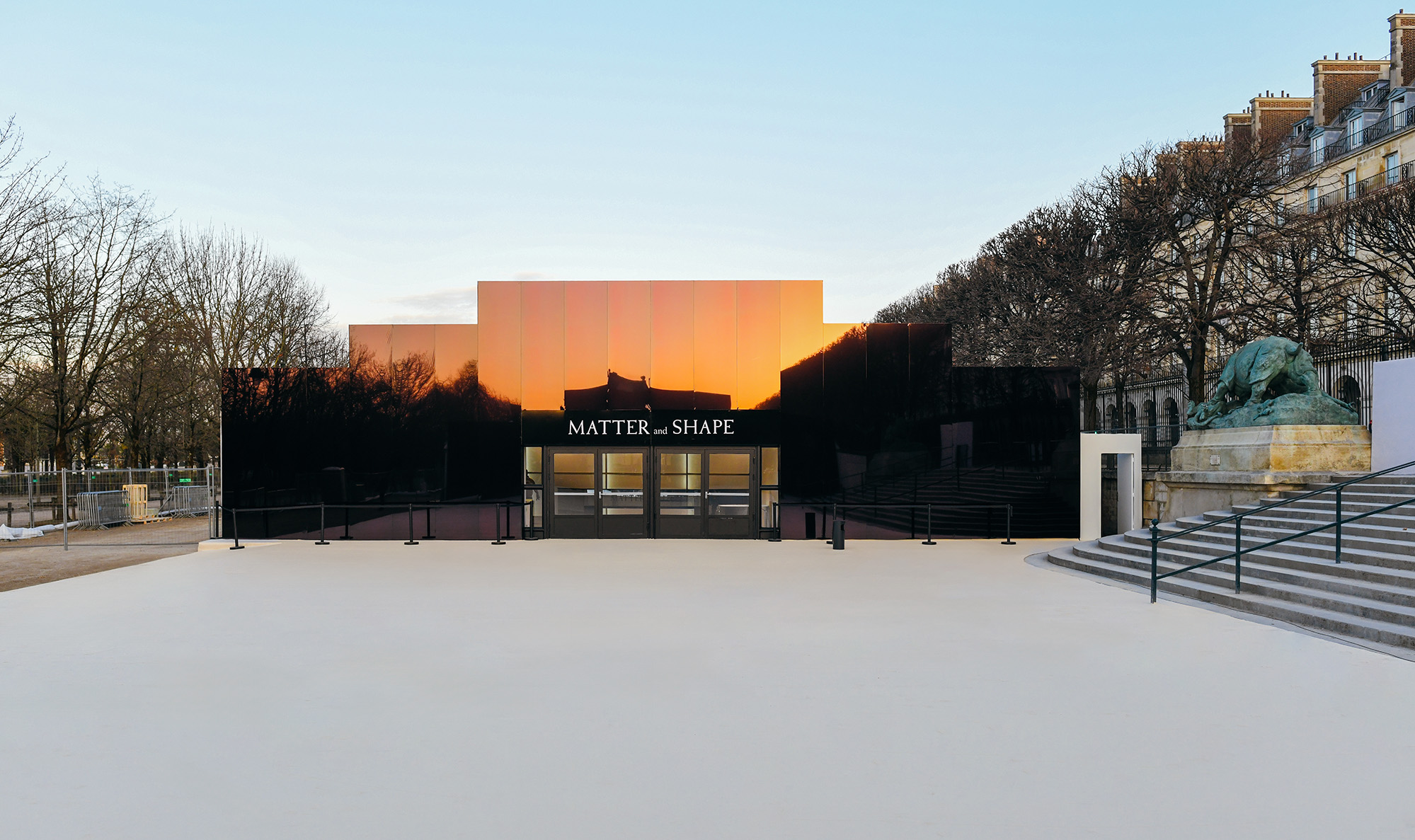
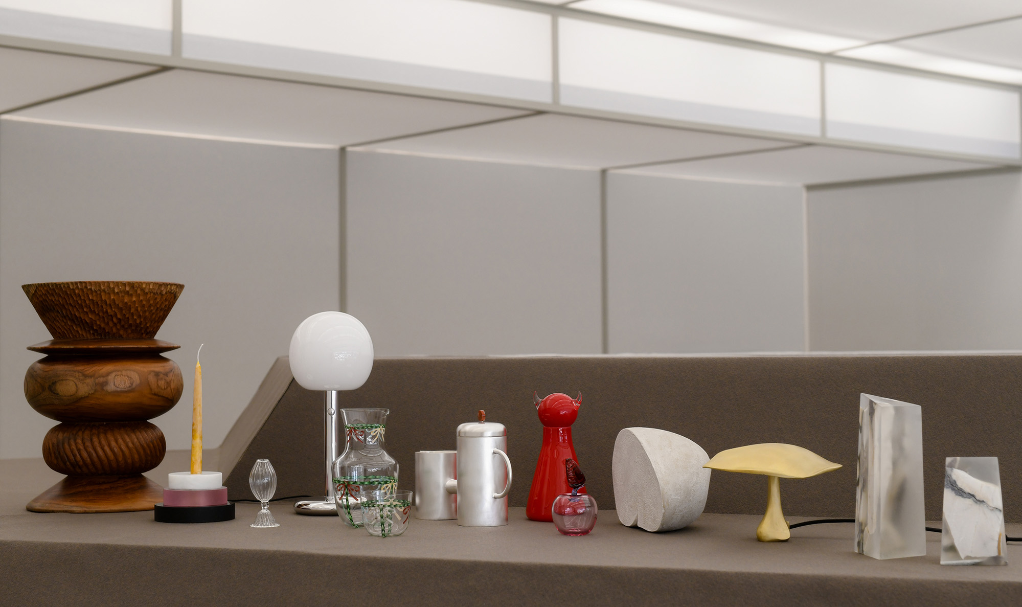
This weekend, the second edition of the design fair Matter and Shape took place in Paris’s Jardin des Tuileries. The insider-focused, ultra-chic showcase (which sits adjacent to its sister event, the fashion industry’s Premiere Classe) presented works in two tents from global outfits large and small, including powerhouse names such as Flos and Byredo. And this year, the fair took on a historical source of conceptual inspiration, the 1925 International Exhibition of Modern Decorative and Industrial Arts, which perfectly encapsulated the mood of design at the moment: unfussy and mature, with an added emphasis on the blurred boundaries between industrial efficiency and a touch of the handmade.
One of the curatorial brains behind the fair—which The Grand Tourist is proud to be a media partner of—is the former editor of A Magazine Curated By, Paris-based, Australian-born journalist Dan Thawley, the event’s creative director. As the gates closed on the last day, I was able to catch up with the discerning aesthete to chat about how it all went, the lessons learned, and what piece he might try and take home once the tents come down.
Matter and Shape in Paris’ Jardin des Tuileries. Photo: Celia Spenard-Ko
As we speak, Matter and Shape has just ended. Now that you have your second show under your belt, how are you feeling about its evolution? I think that it really shows, and we really felt the luxury of having a full year to prepare this event, rather than the five months we had for round one in 2024. I was able to travel to meet people and to really penetrate different markets around the world and pull out my discoveries from different cities and communities, and introduce the show’s concept to them and bring them to Paris. So having that proof of concept from last year was a huge boon. I’m really proud to show work from Turkey, Lebanon, China, the U.S., Ireland…a real mix of designers and companies that wouldn’t have understood the concept previously.
There’s a sort of delicate, stylish DNA to the show that seems extremely Parisian to me. As someone who calls Paris his adopted home, do you think this fair could happen anywhere else? I don’t think it could make sense on this scale and in this context anywhere else. I think it’s the very fact that we’re able to respond to our surroundings, acknowledge the history of craft in France, but also how we included designers and design companies that we think would make sense to the aesthetic crowd of the city. So yeah, for me it does really feel quite intrinsic to Paris. I do believe that Matter and Shape is a conceptual platform that can travel, too. It already has, with events in Milan, Copenhagen, the south of France, and elsewhere in Paris. I think that certain principles of the idea—in terms of the way that we display pieces, the way that we mix and curate design together—can be applied anywhere. But there’s something about the possibilities of the people that we see in this city, in this location, and at this time that do make the magic as well.
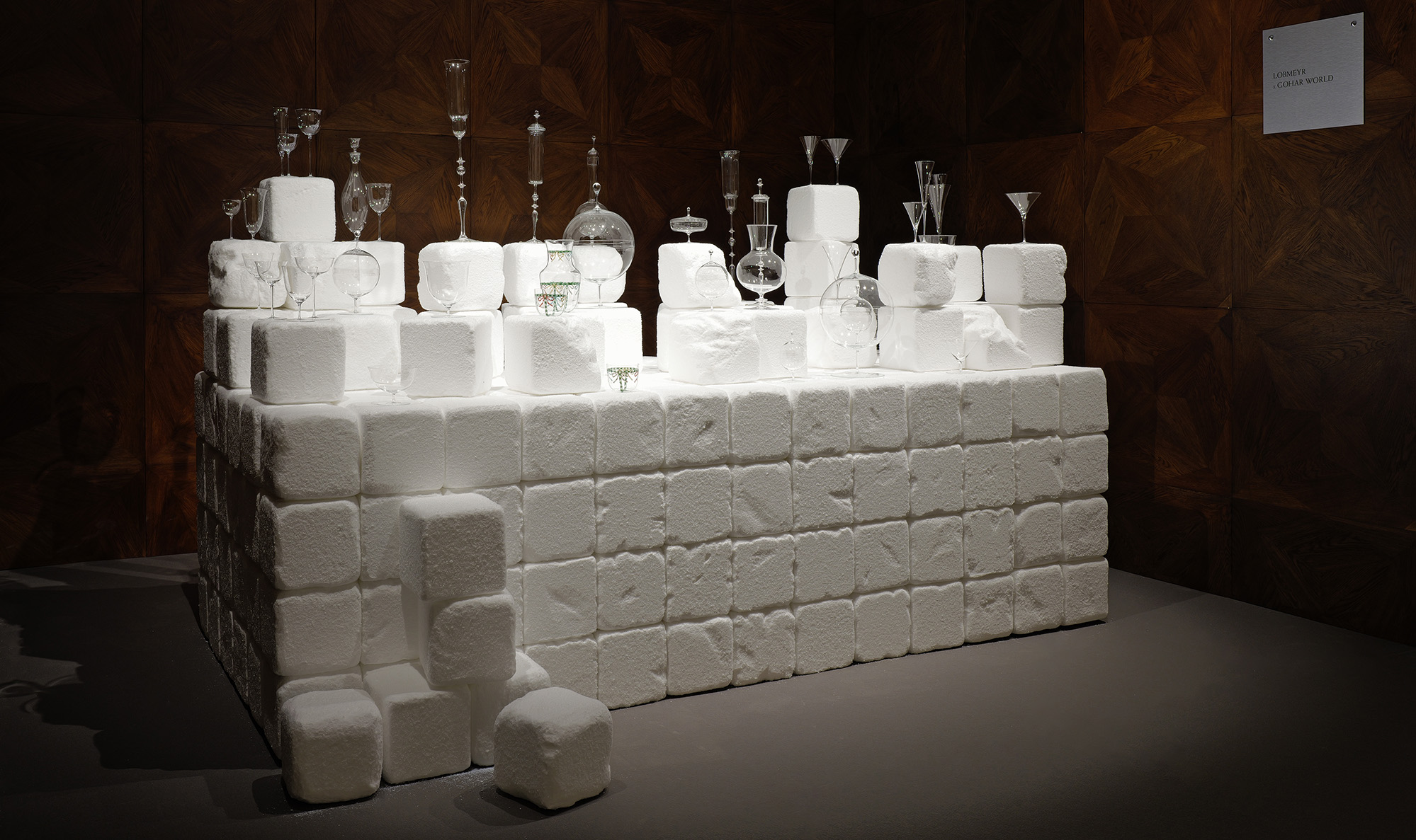
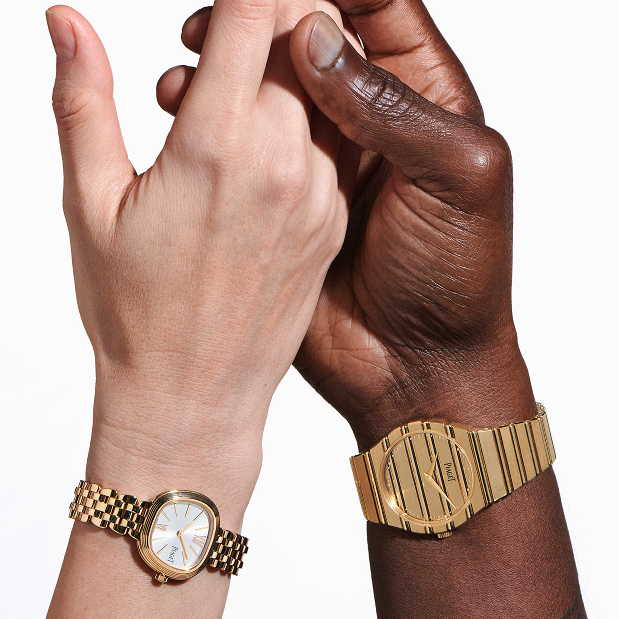
Lobmeyr x Gohar debut new glassware on extra large sugar cubes.Photo: Tom Dagnas
Speaking of Paris, there’s a spiritual connection of sorts this time around to another exhibition in the city from 1925. What’s that about? Since late last year, we’ve been ruminating on the fact that 1925 to 2025 represents a really important centenary. And that is the centenary of the International Exhibition of Modern Decorative and Industrial Arts that happened around Paris between April and October 1925. It was essentially an exposition in the same vein as those that gave birth to the Grand Palais and Eiffel Tower. It was such an international moment for the decorative arts movement. It was also attributed to the early days of modernism with Le Corbusier and his Pavillon de l’Esprit Nouveau, which was quite a radical gesture at the time, and those aesthetics all clashing at the same time. And also this display of a certain amount of decadence, opulence, and artisanal work at a time between the wars, which caused a certain amount of controversy, but also a great deal of fanfare and excitement for people who were able to experience fine arts, decoration, craft, fashion, all in these extremely beautifully and well-thought-out pavilions.
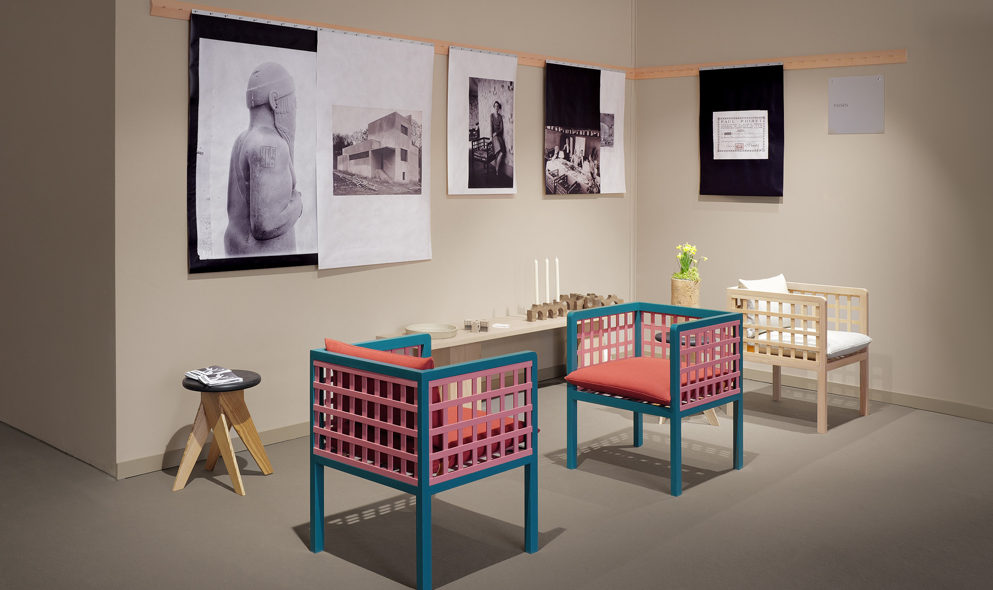
So for us, the idea was to study this beforehand to incorporate elements into the fair. For example, we were inspired by the 1925 Austrian Pavilion and used its lines for our tent’s architecture, which was designed by Willo Perron. We also exhibited chairs from the period by Paul Poiret, re-editioned by Fassen. And we had a Lobmeyr stand designed and curated by Gohar World, Laila Gohar’s company, which featured a table filled with giant sugar cubes. I also curated a show, a small stand inside Matter and Shape, dedicated to the paper ephemera from 1925, including the original catalog, the original map, tickets, the ironwork catalog that showed all of the different façades and ornamentation that were created by various designers for the exhibition. So all of this came together in a beautiful way.
Photo: Celia Spenard-Ko
Jil Sander sponsors talks at the fair. As a fashion and design journalist yourself: What are people talking about? The design talks this year were a response to the nature of Matter and Shape being somewhat of a didactic experience for people to learn about design. After all, we use “learning about the culture of design today” as a tagline to our event. So we use the word salon instead of fair because it should be about exchange and about conversations. But I’m also very aware that they happen in every design event in every city around the world, all the time. I think the idea of these conversations is very en vogue, which I think is a good thing, but it’s also a reason to stop and think about what the public might actually want to listen to. And that’s not always extremely dry conversations about materials and architecture.
Something that was interesting that Willo brought up in one of the talks was the luxury of empty space, which I really enjoyed hearing. That’s something that he already brought up for our first edition when we were in just one pavilion. But the fact we were able to exploit that across two spaces this time has further pushed not only the wow factor of our expansion, but also has allowed visitors to feel that breathing room that happens when you leave the exhibition spaces and the ceilings sort of open out into larger common areas where people can sit, talk, drink a matcha, eat a bento, do a little bit of work, take a meeting, read a book, or even see a film in our movie theater. So just the fact that you were able to use our spaces for different things was super interesting.
Fassen, a French design brand, resurrects old designs archetypes. Photo: Tom Dagnas
And is there any single object in the fair this year that you desperately wanted to have in your home?
Goodness me, that’s a very, very hard question. If there’s one thing that I would never tire of, it may be the Saridis of Athens daybed, designed by Robsjohn-Gibbings in the 1960s from the neo-Grecian heritage of the company from the late 19th century. It’ll be UNESCO Heritage listed soon. It’s made out of Greek chestnut and has all these beautiful curved lines from Greek history and is all laced in beautiful leather. I think it’s something that you could have for multiple generations and never get tired of. matterandshape.com
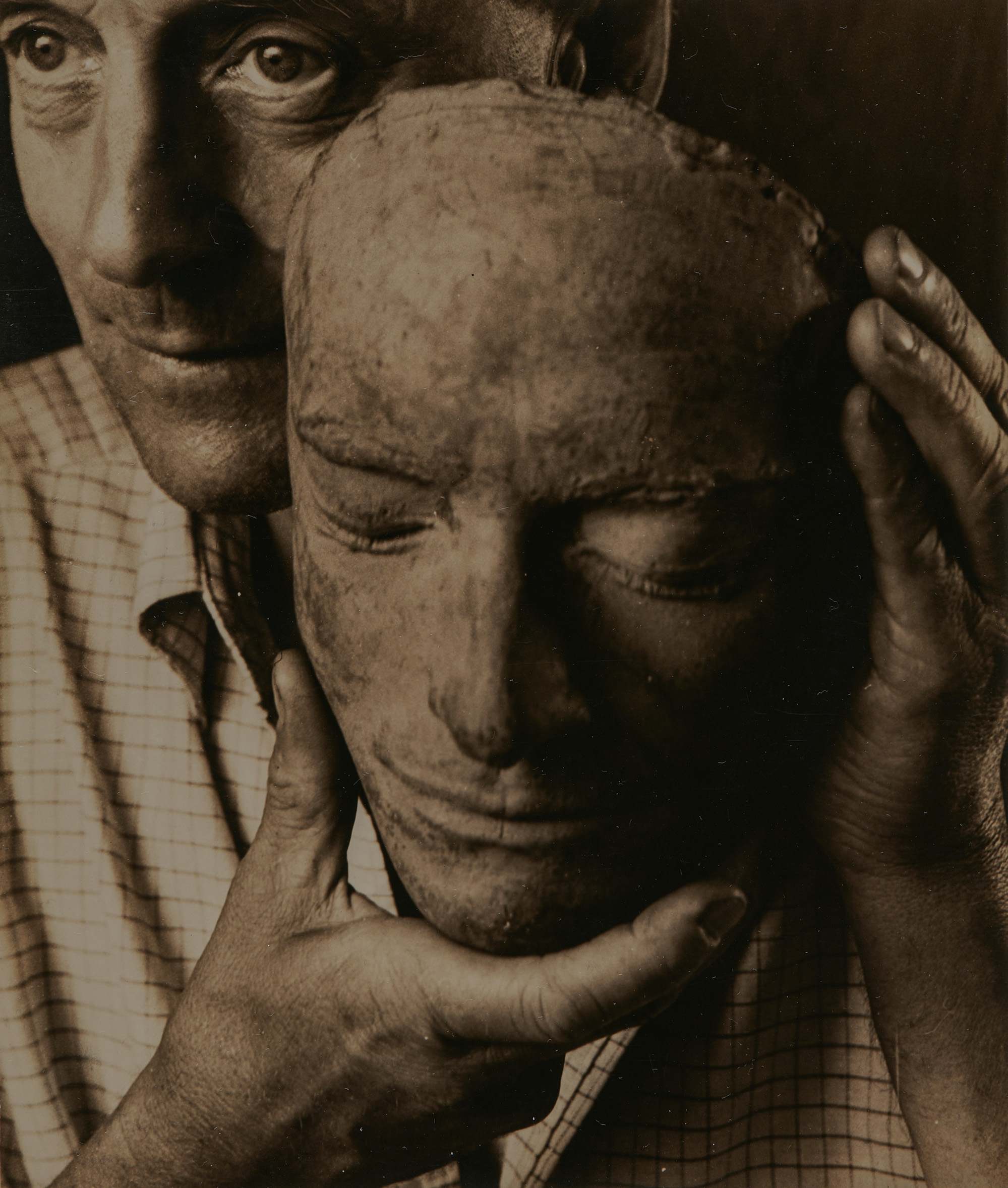
Wharton Esherick photographed by Consuelo Kanaga, 1940. Photo: Courtesy Brooklyn Museum
Late Women Photographers, Performance Artists, and Art Deco Painters Get Their Due
Beacon, “Renée Green: The Equator Has Moved” (Open long-term) Renée Green is an artist and writer in the fullest sense of both crafts. “Is the artist allowed to speak or must his or her works speak for themselves, which leaves open the possibility of all sorts of conjecture?” she said while an undergraduate at Wesleyan studying art. For Green, words and art shouldn’t be separate. Words are often central to her installations, which use sculpture, photography, and video to examine history, culture, and memory. The Cleveland-raised artist’s work has been shown all across the country, at the Hammer Museum, the Whitney, and MCA Chicago, and internationally in Berlin, Venice, and Zurich, but this is her first solo museum presentation in New York. The paintings and installations at Dia span decades of Green’s career, from Color Series (1990), united together for the first time, to newly commissioned work. diaart.org
Brussels, “Jan Van Imschoot: The Haphazardness of Opinions” (Until April 19) “I consider myself a part of a line of non-academic painters, the ones who don’t give a damn about the rules,” said Van Imschoot in a 2019 interview. By then, the Flemish painter was halfway through his 50s and occupied somewhat of a niche—his deft Baroque portraits and tableaus made him one of Belgium’s best contemporary painters yet little known elsewhere. But Van Imschoot, preferring to live undisturbed in the French countryside, isn’t interested in mainstream fame anyway; he’d rather be left to his painting. The 45 airy drawings in this show are a departure from his usual dark and dramatic paintings, though his historical and unreserved attitude remains. Recent drawings of and inspired by the literary figures Albert Camus and Marcel Proust are complemented by a series from 1999. templon.com
Houston, “Tamara de Lempicka” (Until May 26) “I was the first woman to paint cleanly, and that was the basis of my success,” said Tamara de Lempicka in the late days of her career. “It was precise. It was ‘finished.’” At the height of Lempicka’s fame, the Polish painter was working in Paris, where her decadent, polished portraits suited the mood of the ’20s. She, like her art, was distinctive and alluring. (Her birthplace and age were a mystery, she kept a glamorous lifestyle, she had male and female models and lovers, and she had a penchant for cocaine.) But as World War II began and Art Deco fell out of favor, so did her paintings. In 1939, Lempicka relocated to California, but her exhibitions in America never achieved the heights she hoped they would—though her work experienced a renaissance shortly before her death in the ’80s, with fans including Madonna and Barbra Streisand. Now, the first American survey of her work comes to Houston with 100 paintings and drawings celebrating Lempicka’s distinctive career. mfah.org
“Rose Finn-Kelcey: Suit of Lights” in London. Photo: Courtesy Kate MacGarry
London, “Rose Finn-Kelcey: Suit of Lights” (Until April 12) In the late 1960s, Rose Finn-Kelcey joined the growing ranks of artists experimenting with performance art. “I realized,” she says in an interview, “that actually a lot of my work is inspired by a location, and by the history or the architecture of that particular location, so when I’m confronted with a gallery, I don’t have that.” The British artist’s originality and wit differentiated her: She flew mammoth flags with the words “Power for the People” from a power station in London, created a vending machine that dispenses prayers instead of sweets, replicated Van Gogh’s Sunflowers out of coins, made a sculpture out of a cloud, and wrote to priests in Rome asking them to draw what they thought God looked like. In recent years, Finn-Kelcey has gotten the institutional acclaim she didn’t receive before her death at 69 in 2014—her work was seen at Frieze and in “Women in Revolt!” at the Tate in 2023. Here, three performance works, Suit of Lights (1986–1990), Bull’s Eye (1985), and One for Sorrow, Two for Joy (1976), are presented in photo and video. katemacgarry.com
New York, “Consuelo Kanaga: Catch the Spirit” (Opens March 14) In 1993, the New York Times reviewed Kanaga’s first major retrospective at the Brooklyn Museum, writing “her body of work, though comparatively small, is consistently exceptional. Consuelo Kanaga died virtually unknown in 1978, but her talent endures.” It’s surprising that the American photographer, whose career was as humbly exceptional as her images, isn’t better remembered. Her first job in 1915, as reporter and part-time photographer for the San Francisco Chronicle, was an exceptionally rare feat for a woman at the time. She was 21. In 1932, she was invited to participate in the inaugural Group f/64 exhibition at the de Young Museum, though her work was deemed too emotional and socially engaged for her to officially join the group. Kanaga—constantly on the move between San Francisco, New York, and elsewhere—documented America’s social issues with a soft, subtle touch and delicate attention to form. Now, nearly 50 years after her death, another retrospective at the Brooklyn Museum presents 200 of her black-and-white photographs and films. It includes her most famous photo, She is a Tree of Life (1950), in which a young Black woman stands flanked by her two children. brooklynmuseum.org —Vasilisa Ioukhnovets